Wedding color palettes: 25 combinations that actually work
Picking a wedding color palette sounds simple until you’re staring at 400 paint swatches on Pinterest, your venue has warm wood tones, and your florist is asking you for a direction by Friday. Most couples pick colors they like as a feeling, only to realize too late that feelings don’t translate directly into cohesive tablescapes.
Here’s what I’ve learned after planning countless weddings: the combinations that actually work share a few things in common. They have one anchor color (the dominant hue that takes up the most space), one complement (the supporting shade that shows up in florals, wedding invitations, or bridesmaid dresses), and one accent (the metallic or pop of color that ties everything together). That’s it. Three tones, used consistently, will always outperform a six-color palette used inconsistently.
This guide gives you 25 wedding color combinations across classic, modern, romantic, soft, and seasonal styles covering everything from timeless wedding theme color schemes to unexpected color combos you probably haven’t seen yet. Each color scheme includes practical notes on where to use each hue, how to balance the tones, and what to avoid. Whether you’re deep in wedding planning or just starting to gather color inspiration, this is the only list you need.

Pro Tip: Before you commit to any palette, build a quick moodboard. Pull three physical swatches and hold them against your venue’s dominant material: the floor, the wall, the linen, or the wood. A dusty blue that looks perfect on a screen or on a moodboard wedding color palette you pinned six months ago can disappear against warm timber or clash with a beige ballroom carpet. The season of your wedding matters here too natural light in June reads colors very differently than December candlelight.
Classic & Timeless Wedding Color Palettes (1–5)
1) Blush Pink + Ivory + Gold (The Wedding Standard Done Right)

This is the most popular wedding color combination for a reason: blush is gentle without being sweet, ivory keeps things elevated, and gold adds warmth and edge. The problem is that most couples use too much blush. When blush dominates, the color scheme starts to look like a baby shower. When ivory is the anchor and blush appears in controlled moments, it reads sophisticated and elegant.
- Anchor: ivory linens, white florals, ivory stationery
- Complement: blush in bridesmaid dresses, ribbon, and 30% of florals
- Accent: warm gold in candleholders, flatware, and frame details
- Best for: ballrooms, garden venues, tented receptions
One rule worth repeating: do not mix rose gold and yellow gold in the same space. Choose one metallic and commit to it everywhere.
2) Navy + White + Silver (Clean, Graphic, and Always Camera-Ready)

Navy reads confident and formal without being stuffy. The high contrast it creates against white florals and ivory skin tones means navy receptions tend to deliver some of the sharpest shots of the night without extra effort. Silver keeps the look cool and modern rather than warm and traditional. This color scheme is especially powerful in evening receptions, where lower light deepens the navy and makes everything snap into focus.
- Anchor: navy bridesmaid dresses or table linens
- Complement: crisp white florals, white wedding invitations with navy text
- Accent: silver candleholders, mercury glass votives, silver-edged menus
- Best for: evening receptions, modern ballrooms, nautical venues
- Photo tip: ask for white flowers with green foliage so navy doesn’t absorb too much light
Expert Insight: Navy works best as a color block, not a scattered accent. Put it on the bridesmaids or the linens, not both. Spreading a dark anchor color across too many elements makes a room feel heavy.
3) Burgundy + Blush + Champagne (The Romantic All-Rounder)

This wedding color palette spans every season. In fall and winter it feels warm and moody; in spring and summer it reads romantic and garden-ready. Burgundy is the anchor, blush softens it, and the champagne element adds a luminous warmth that prevents the color scheme from feeling heavy. If the lavender and mauve palettes later in this guide feel too delicate for your taste, this is the romantic alternative with real backbone.
- Anchor: burgundy florals, napkins, or bridesmaid dresses
- Complement: blush table runners, ribbon, and lighter blooms
- Accent: champagne or warm metallic in glassware and candle holders
- Best for: barn venues, garden estates, historic buildings
- Seasonal note: swap blush for dusty rose in fall for a richer, moodier feel
4) Black + White + Gold (The Timeless Formal Choice)

If you want your wedding to feel like a classic black-tie event, this color combination delivers. Black is rare in wedding color palettes, which is exactly what makes it feel intentional and high-fashion when it appears. White keeps the look fresh and gold elevates it into something truly elegant. The key is restraint with the black, it works as an accent detail, not an anchor.
- Anchor: white florals, white linens, white wedding invitations
- Complement: black typography, black ribbon, black charger plates or napkins
- Accent: warm gold throughout (flatware, candleholders, frame signage)
- Best for: formal ballrooms, black-tie events, modern urban venues
For the full range of decor decisions that take black and white from concept to cohesive, the classy wedding decor guide is worth reading before your first vendor meeting.
Trend Alert: Black details in formal weddings are having a major moment. A black linen napkin with a gold monogram or a black ribbon on a white bouquet instantly reads editorial and modern without requiring a full palette overhaul. If the white and gold direction speaks to you, our guide to white and gold wedding must-haves covers every element worth investing in.
5) Dusty Blue + White + Greenery (The Effortless Classic)

Dusty blue is the rare hue that reads neither too formal nor too casual which is why it holds up across every season and venue type. Paired with clean white and lush greenery (eucalyptus, fern, olive), this wedding color palette feels fresh and natural, and the muted tone prevents florals from competing with each other. It’s a strong choice for couples who want an understated color scheme with real visual impact.
- Anchor: dusty blue in bridesmaid dresses or table linens
- Complement: white florals and crisp white wedding invitations
- Accent: deep greenery in all arrangements, eucalyptus-heavy centerpieces
- Best for: garden venues, outdoor ceremonies, vineyard receptions
- Avoid: adding silver or gray alongside dusty blue, the tones compete
Modern & Fresh Wedding Color Palettes (6–10)
6) Sage Green + Dusty Rose + Champagne (The Modern Romantic)

This color combination replaced blush and gold as the go-to modern romantic wedding color palette because sage green grounds it with an organic, natural feeling that gold never quite achieves. Dusty rose has just enough warmth to keep the color scheme from feeling clinical, and champagne adds a soft glow. The tonal balance gives this palette exceptional depth in photos, you get real dimension without needing a fourth color.
- Anchor: sage green in bridesmaid dresses, ribbons, or linen
- Complement: dusty rose florals, blush candles, or textured paper goods
- Accent: champagne or soft gold in candles, flatware, and small details
- Best for: garden venues, outdoor receptions, greenhouse settings
- Photo tip: add cream-toned foliage rather than bright green for cohesion
Key Takeaway: Sage green is one of the most versatile wedding colors available. It works in spring, summer, fall, and even winter; it just needs the right companion tones to shift the seasonal feeling. This makes it a top pick regardless of your wedding season. See the full sage green wedding theme guide for a deep dive on florals, venue styling, and bridesmaid looks.
7) Terracotta + Cream + Copper (The Earthy Modern Palette)

Terracotta became a dominant force in weddings because it brings warmth without trying too hard. It feels grounded, organic, and photogenic in both natural and candlelight. Paired with cream instead of white, this wedding color scheme avoids looking too stark, and copper accents add richness without the formality of gold.
- Anchor: terracotta in florals (dried blooms, pampas, ranunculus), candles, or napkins
- Complement: cream linens, ivory stationery, nude or off-white bridesmaid dresses
- Accent: copper candleholders, copper bar details, copper frame signage
- Best for: desert venues, rustic barns, outdoor fall weddings
Here’s what I’ve learned about terracotta: dried botanicals and pampas grass do more for this palette than any fresh flower. Let the botanicals lead and the florals support.
8) Slate Blue + Warm White + Cognac (The Unexpected Combination That Always Works)

This one looks unusual on paper and stunning in real life. Slate blue is cooler and more muted than dusty blue, which creates a striking contrast with the warmth of cognac leather or amber glass. Warm white softens the contrast and keeps this wedding color palette from looking like a men’s magazine editorial.
- Anchor: warm white linens, florals, and stationery
- Complement: slate blue in stationery accents, ribbons, or bridesmaid dresses
- Accent: cognac leather menus, amber glassware, warm wood elements
- Best for: industrial venues, lofts, modern spaces with warm wood or brick
- Styling trick: cognac leather menu covers and place cards tie this color scheme together instantly
Actionable Tip: If you love slate blue but your venue runs warm, use cognac as your accent in small doses. One cognac leather detail per table (a menu card, a small book, a tag) is enough to balance the cool blue without changing the whole palette.
9) Dusty Mauve + Ivory + Gold (The Quiet Luxury Palette)

Dusty mauve sits between pink and purple, which makes it chameleon-like: it can feel romantic, sophisticated, or editorial depending on how it’s styled. This is the palette that skews more formal than flora, the ivory anchor and gold accent push it toward structured elegance rather than the garden-party softness of blush. This wedding color palette leans into the old money, quiet luxury aesthetic that is dominating high-end weddings right now.
- Anchor: ivory throughout (linens, stationery, florals)
- Complement: dusty mauve in bridesmaid dresses, florals, and ribbon accents
- Accent: gold in flatware, charger plates, and geometric décor
- Best for: formal ballrooms, upscale hotel venues, evening receptions
- Avoid: choosing a mauve hue that reads too pink under your venue’s lighting
10) Olive Green + Off-White + Warm Gold (Effortlessly Sophisticated)

Olive is the deeper, earthier alternative to sage green, and it needs off-white rather than bright white, because its warmth gets washed out against stark tones. Warm gold amplifies the richness and prevents the palette from reading too quietly.
- Anchor: off-white linens and organic florals (garden roses, ranunculus)
- Complement: olive in greenery-forward centerpieces, napkins, or bridesmaid accents
- Accent: warm gold in candles, candleholders, and frame signage
- Best for: Italian-inspired venues, vineyard weddings, fall garden celebrations
- Floral move: olive and white garden roses with antique gold ribbon creates an instant elegant wedding feel
Romantic Wedding Color Combinations with Jewel Tones (11–15)
These are the combinations for couples who want impact. The jewel-tone color family photographs with extraordinary depth, but every one of them needs a white or ivory anchor so the eye has somewhere to rest.
11) Deep Red + Ivory + Gold (The Most Romantic Combination There Is)

Red is the color of love, and it has been underused in weddings for years. Done right, deep red combined with ivory and gold does not read Christmas or Valentine’s Day; it reads Italian countryside, old-world romance, and the kind of elegant wedding you talk about for years. The key is depth: you want a rich, complex red (think bordeaux or oxblood), not a flat primary red.
- Anchor: ivory linens and white florals to prevent the room from feeling heavy
- Complement: deep red in florals, velvet ribbon, and bridesmaid dresses
- Accent: warm gold in flatware, charger plates, and pillar candles
- Best for: historic venues, Italian-inspired spaces, dramatic indoor receptions
- Proportion rule: red should make up no more than 35% of the visual space
Styling Hack: Use deep red roses with white or ivory accents rather than going all-red. A centerpiece that is 70% white blooms with deep red roses woven through will photograph more beautifully than a fully red arrangement every single time.
If bold red speaks to you but a full palette commitment feels like too much, the red and white wedding guide covers a simpler take on the same energy.
12) Emerald Green + White + Gold (The Most Elevated Palette on This List)

Emerald green is one of the few deep colors that reads as lush and celebratory rather than heavy. Against white and gold, it gives any venue the visual weight of a destination wedding without the travel budget. This jewel-toned palette holds its own in every season and lighting condition.
- Anchor: white florals, white linens, white stationery
- Complement: emerald in greenery-forward arrangements, velvet ribbon, or accent pieces
- Accent: gold in all metallic elements (flatware, glassware stems, candleholders)
- Best for: ballrooms, luxury hotels, garden estates, destination weddings
- Trend note: emerald velvet ribbon on a white bouquet has become iconic for good reason
Expert Insight: Emerald green is one of the few wedding colors where going bolder actually looks more elegant. A confident emerald tablecloth or emerald velvet napkin reads far more sophisticated than a diluted sage or muted green alternative.
13) Cobalt Blue + White + Gold (The Statement Palette)

This color combination is for the couple who wants to make a visual statement on their big day. Cobalt is a vivid, saturated hue, which means it needs white to breathe and gold to keep the wedding color scheme from looking cold. It reads like a Mediterranean summer: sunny, joyful, and completely unforgettable.
One hard rule before anything else: no blue florals alongside cobalt. Too much saturation in one color family and the whole scheme collapses.
- Anchor: white throughout (linens, florals, stationery)
- Complement: cobalt in bridesmaid dresses, napkins, or stationery accents
- Accent: gold in every metallic element to warm the vivid blue
- Best for: summer weddings, coastal venues, destination celebrations
14) Plum + Lavender + Silver (The Romantic Purple Palette)

Purple palettes either land perfectly or feel dated; the difference is almost entirely proportion. Lavender as the anchor, plum as the deeper accent, silver as the modern edge. That’s the formula.
- Anchor: lavender bridesmaid dresses or light linen tones
- Complement: plum in florals (deep garden roses, dahlias, anemones)
- Accent: silver in all metallic elements and stationery details
- Best for: evening receptions, garden weddings, spring celebrations
- Proportion note: plum should stay in the florals, keeping it off the linens prevents visual heaviness
15) Rich Burgundy + Navy + Copper (The Fall Wedding Powerhouse)

This color combination is made for October and November. The depth of burgundy and navy together creates a sophisticated, moody visual story, and copper adds enough warmth to prevent the wedding color scheme from feeling cool or somber. It is one of the most cohesive fall wedding palettes because each hue is grounded in autumn tones. Pair it with rustic barn wedding ideas, and you have one of the strongest fall combinations available.
- Anchor: navy in bridesmaid dresses or table linens (not both)
- Complement: burgundy florals (dahlias, roses, dried flowers)
- Accent: copper in all metallics including candle holders, flatware, and bar details
- Best for: fall barn weddings, vineyard receptions, intimate indoor celebrations
- Avoid: adding gold alongside copper, the metallics compete and look unintentional
How-To: To execute the burgundy and navy combination without it feeling heavy, use copper as a warm bridge between the two dark tones. Place copper candleholders between burgundy florals on navy linens and the visual connection is instant.
Soft Wedding Color Palettes for Spring and Summer (16–20)
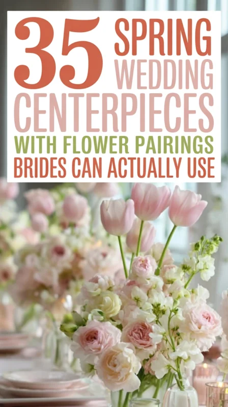
Pastel shades and muted tones photograph beautifully in natural light, which is why they dominate spring and summer weddings. But here’s the catch: muted doesn’t mean boring. The combinations below all have genuine sophistication. For spring florals that carry these tones, see 35 spring wedding centerpieces that actually work. For the wider soft palette world beyond these five, 25 pastel wedding theme ideas are worth a look.
16) Lavender + Blush + Silver (The Modern Dreamy)

Lavender has re-emerged as a serious wedding color because this hue sits between pink and purple in a way that feels both feminine and unexpected. Paired with blush it stays soft and pastel, and silver keeps the wedding color scheme from leaning too sweet or youthful. Of all the pink-adjacent palettes in this guide, this is the one that needs natural light to fully sing, it’s built for outdoor daytime ceremonies and receptions, not candlelit ballrooms.
- Anchor: blush in linens and the majority of florals
- Complement: lavender in bridesmaid dresses, ribbons, and select blooms
- Accent: silver in all metallic details including candleholders and stationery
- Best for: garden weddings, spring celebrations, airy outdoor venues
- Styling note: sweet peas, stock, and garden roses carry this pastel palette beautifully in florals
17) Peach + Coral + Champagne (The Warm Summer Palette)

Peach and coral together create a sun-warmed, joyful color story that comes alive in natural light, these tones hold warmth and saturation in a way most pastels start to lose by midday. They sit in a warm pastel color family that feels celebratory without being loud. The champagne color palette is the secret ingredient here: it replaces the more obvious gold and keeps everything light and airy rather than formal. This wedding color combo consistently ranks as one of the most saved on Pinterest for summer celebrations.
- Anchor: champagne or ivory throughout linens and stationery
- Complement: peach and coral in florals (ranunculus, poppies, garden roses)
- Accent: champagne glassware and warm candlelight
- Best for: outdoor summer weddings, coastal venues, greenhouse receptions
- Season tip: this pastel color scheme is strongest in June and July when warm light is abundant
Actionable Tip: Ask your florist to include garden roses in both peach and coral, then soften with white ranunculus. The slight color variation between blooms creates depth without adding a third tone.
18) Dusty Rose + Cream + Eucalyptus (The Consistently Beautiful)

But here’s the deal: dusty rose is not blush. It sits deeper and warmer, which means it reads more vintage than romantic, closer to an antique petal than a fresh bloom. Where lavender and blush reads spring garden, dusty rose reads heirloom and intimate. Cream (rather than stark white) reinforces that warmth, and eucalyptus adds a green anchor that grounds every arrangement.
- Anchor: cream linens and ivory stationery
- Complement: dusty rose in florals, ribbon, and bridesmaid dresses
- Accent: eucalyptus in all arrangements as the greenery anchor
- Best for: barn venues, rustic settings, garden-to-ballroom transitions
- Distinction tip: if your florals look pink rather than dusty, ask your florist to deepen the tone
If the vintage direction speaks to you, timeless vintage wedding ideas go much deeper into how to execute that aesthetic throughout the whole day.
19) Powder Blue + Soft Yellow + White (The Fresh and Cheerful Combination)

This is the hardest palette to pull off and one of the most beautiful when it lands. Yellow tips toward casual the moment it’s overused, so powder blue grounds the scheme, white dominates, and soft yellow appears in controlled moments only: a signature drink, a ribbon, one bloom per arrangement.
- Anchor: white throughout (florals, linens, stationery)
- Complement: powder blue in bridesmaid dresses or accent linens
- Accent: soft yellow as a pop of color in florals (ranunculus, garden roses), ribbon, or bar details
- Best for: spring weddings, outdoor daytime celebrations, coastal venues
- Restraint rule: yellow should appear in 15% or less of the total visual space
20) Mauve + Dusty Purple + Gold (The Quiet Statement)

Mauve and dusty purple together create a layered palette with real visual dimension, it gets better as the evening light drops and the room warms up. Gold elevates the combination and prevents it from reading too muted or flat. Of all the mauve-adjacent palettes on this list, this is the one for intimate evening receptions where you want the room to feel layered and grown-up rather than bright and airy.
- Anchor: mauve in linens and the majority of florals
- Complement: dusty purple in deeper florals (dahlias, lisianthus, anemones)
- Accent: warm gold throughout all metallic details
- Best for: evening receptions, formal venues, fall celebrations
- Styling tip: layering mauve and dusty purple in the same floral arrangements creates the most impact
Favorite: Mauve velvet napkins with gold flatware on a clean white linen is one of the most effortlessly beautiful table settings I have ever executed for a client. The combination of texture (velvet), warmth (gold), and muted tone (mauve) does the heavy lifting so the rest of the table can stay minimal.
Fall Wedding Color Palettes and Winter Wedding Colors (21–25)
21) Burnt Orange + Cream + Brown (The Fall Wedding at Its Best)

The orange in this color scheme is not bright or pumpkin-adjacent, it is the burnt, earthy orange of autumn leaves, paprika, and dried botanicals. Paired with cream and warm brown tones (cognac leather, dark wood, chocolate linens), it creates the most authentically fall wedding color palette on this list. If you’ve been searching for fall wedding ideas that don’t look like every barn wedding you’ve ever seen, this is your answer.
- Anchor: cream linens and ivory stationery
- Complement: burnt orange in florals, pampas grass, and ribbon details
- Accent: warm brown in menus, charger plates, and natural wood details
- Best for: barn weddings, rustic venues, outdoor fall weddings
Dried botanicals and fall foliage, oak leaves, seed pods, and dried citrus extend this palette into every corner of the reception without adding to your floral budget. 45 rustic wedding centerpieces covers the specific arrangements that make this color palette come alive.
22) Dusty Teal + Blush + Copper (The Hidden Gem)

Most couples overlook teal because it feels bold, but dusty teal, the muted, gray-leaning hue, is one of the most sophisticated wedding colors available. Paired with blush, it softens completely, and copper adds the warmth the wedding color scheme needs to feel wedding-ready rather than interior-design-project-ready.
- Anchor: blush in linens and most florals to keep the color scheme soft
- Complement: dusty teal in bridesmaid dresses, ribbon, or stationery accents
- Accent: copper in all metallics including flatware, candleholders, and bar carts
- Best for: modern venues, urban spaces, destination beach weddings
- That’s why it works: the dusty quality of the teal prevents it from competing with blush, instead they balance each other
Bonus: Dusty teal wedding invitations with copper foil lettering and blush ribbon binding are one of the most requested stationery combinations right now. Start there if you are not sure how to introduce the color.
23) Chocolate Brown + Caramel + Ivory (The Unexpected Warmth)

Brown sounds like the most boring choice, but chocolate and caramel together read as rich, warm, and deeply elegant, especially in candlelight. Ivory keeps it from feeling heavy, and the whole combination has a timeless quality that is immune to trends.
- Anchor: ivory in florals and linens throughout
- Complement: caramel in ribbon, bar details, and natural wood elements
- Accent: chocolate brown in velvet napkins, charger plates, or signage frames
- Best for: vineyard weddings, intimate receptions, destination European venues
- Photography note: this neutral palette photographs with exceptional depth in low, warm lighting
24) Deep Forest Green + White + Gold (The Grandeur Palette)

Forest green at full saturation is one of the most dramatic choices you can make for your big day, and it pays off completely when white and gold are given enough space. Think dark leafy centerpieces against white tablecloths, gold candleholders, and white dinner plates. The contrast is striking, you get the visual drama of a destination wedding without leaving your own city.
- Anchor: white throughout linens, florals, and stationery
- Complement: deep forest green in lush centerpieces and greenery-heavy arrangements
- Accent: warm gold in every metallic element
- Best for: ballrooms, luxury hotels, formal evening receptions
- Seasonal range: this wedding color palette works in every season, but is especially powerful for fall or winter weddings
Key Takeaway: If you want a winter wedding that does not lean into traditional Christmas palettes, forest green and white with warm gold delivers drama, depth, and complete seasonal appropriateness without a single snowflake detail.
25) Midnight Blue + Silver + Ivory (The Evening Wedding at Its Most Elegant)

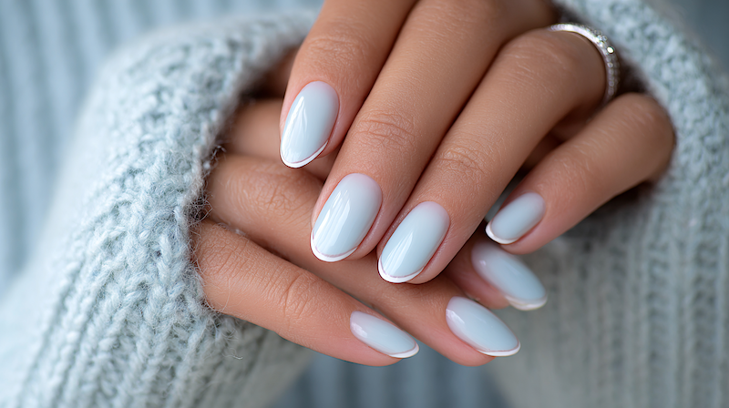
This is the wedding color palette I recommend for couples who want a formal, black-tie-adjacent celebration without committing to black, and one of the best winter wedding colors available. Midnight blue reads as the most sophisticated hue in the blue color family, darker, more complex, slightly more mysterious than navy. Silver adds light and dimension, and ivory prevents the color scheme from reading too cold or too stark. That’s why this winter wedding color combo looks extraordinary in the low, golden lighting of a December or January reception. If you’re planning winter nails to match, see our roundup of winter wedding nail ideas for color combos that complement this palette perfectly.
- Anchor: ivory throughout linens, florals, and stationery
- Complement: midnight blue in velvet accents, bridesmaid dresses, or stationery
- Accent: silver in all metallics, mercury glass, and crystal elements
- Best for: formal evening receptions, ballroom weddings, black-tie events
- Lighting tip: this wedding color palette transforms under candlelight, blue deepens beautifully and silver catches the flame
How to Finalize Your Wedding Color Palette (A Quick Guide)
Choose your palette first and every decision that follows gets easier. Here is the simplest way to lock it in before your first vendor conversation.
- Build a moodboard first: gather wedding theme ideas, venue photos, floral inspiration, fabric textures, table setting images, and see how your chosen color combos hold together before you commit to anything
- Name your three tones: anchor, complement, accent
- Hold swatches in your venue: natural and artificial lighting both
- Confirm with your florist first: some bloom colors are seasonal or require lead time
- Lock your wedding invitations before anything else: they set the guest’s first impression and establish the color scheme before your big day arrives. Read our guide to wedding invitation wording so the tone matches the palette
- Photograph the palette: take a photo of your three swatches together and save it as your reference image so every vendor is working from the same source
Pro Tip: Do not wait until you have chosen your dress, venue, flowers, and bridesmaid dresses before deciding on a color palette. The palette should come first. It simplifies every decision that follows, from florals to wedding invitations to table linen choices.
A Note on Metallics
Every wedding color palette on this list uses either gold, silver, or copper as an accent, and for good reason. The bottom line is that metallics function as a visual thread, they tie unrelated elements together and add a level of finish that no matte tone achieves on its own.
Here is the simplest rule for choosing your metallic based on your color family:
- Warm palettes (terracotta, burgundy, sage, blush, mauve): gold or copper
- Cool palettes (navy, dusty blue, midnight blue, plum): silver
- Neutral wedding color palettes (black and white, ivory, champagne): your choice, warm or cool based on your venue
You’re better off committing to one metallic and using it everywhere than mixing gold and silver in the same space.
Which Wedding Color Palette Is Right for You?
If you are still undecided after working through this list, here is the shortcut. Think about the one word that best describes the feeling you want on the day, then match it below.
- Timeless and classic: Blush + Ivory + Gold (Palette 1) or Dusty Blue + White + Greenery (Palette 5)
- Modern romance: Sage Green + Dusty Rose + Champagne (Palette 6)
- Editorial formality: Black + White + Gold (Palette 4) or Dusty Mauve + Ivory + Gold (Palette 9)
- Earthy and organic: Terracotta + Cream + Copper (Palette 7) or Olive Green + Off-White + Warm Gold (Palette 10)
- Bold and dramatic: Emerald Green + White + Gold (Palette 12) or Deep Red + Ivory + Gold (Palette 11)
- Soft and spring-ready: Lavender + Blush + Silver (Palette 16) or Peach + Coral + Champagne (Palette 17)
- Vintage warmth: Dusty Rose + Cream + Eucalyptus (Palette 18) or Burgundy + Blush + Champagne (Palette 3)
- Fall richness: Rich Burgundy + Navy + Copper (Palette 15) or Burnt Orange + Cream + Brown (Palette 21)
- Winter elegance: Midnight Blue + Silver + Ivory (Palette 25) or Deep Forest Green + White + Gold (Palette 24)
- Unexpected and distinctive: Slate Blue + Warm White + Cognac (Palette 8) or Dusty Teal + Blush + Copper (Palette 22)
The bottom line is that the right palette is the one that still feels like you six months after you chose it. Pick one, commit to the three tones, and let everything else follow.

