Dusty Blue Wedding Ideas: The Complete Color Palette Guide
Why Dusty Blue Is So Popular for Weddings
The dusty blue wedding has become one of the most popular color choices for modern weddings, and it’s not hard to see why.
It sits in a rare sweet spot: sophisticated enough for a formal ballroom, relaxed enough for a barn, versatile enough for every season, and flattering across a wide range of skin tones.
Three bigger shifts in wedding style have helped push dusty blue to where it is now:
- The move toward muted, organic palettes. Couples are stepping away from saturated, high-contrast colors and gravitating toward hues that feel more like they belong in nature. Dusty blue fits naturally alongside sage green, warm terracotta, and soft burgundy.
- The rise of tactile, textured weddings. Linen runners, raw-edge florals, hand-loomed napkins, stone compotes, and natural wood accents are everywhere right now, and dusty blue pairs with all of it effortlessly.
- The renewed love for something blue. Rather than hiding a tiny blue detail in a shoe or a garter, couples are leaning into it. Dusty blue lets you make “something blue” the entire visual story of your wedding.
Trend Alert: Blue-toned wedding color palettes have remained consistently popular on Pinterest and across wedding inspiration searches, with muted shades like dusty blue continuing to show up in editorial styling, saved mood boards, and seasonal color trend roundups.
What Color Is Dusty Blue?
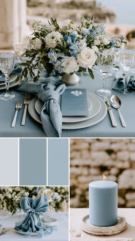
Dusty blue is a muted, desaturated shade of blue with a grey undertone and a faint whisper of green or lavender depending on the specific hue.
It’s not bright, not pastel, and not cold in the way ice blue can read in photos. It’s softer, earthier, and more visually complex than most blues you’ll find on a standard color chart.
That grey undertone is the secret weapon. It’s what makes dusty blue look intentional rather than generic, and what allows it to pair so naturally with greenery, linen textures, brushed silver metallics, and organic florals.
Expert Insight: Always look at your dusty blue choice in three different lighting conditions before committing: afternoon natural light, golden hour outdoor light, and indoor venue light. The color can shift significantly between them, and what looks perfect outdoors can read flat or muddy inside.
Here’s how dusty blue compares to the other shades in the same family:
| Shade | Undertone | Feel | Best for |
|---|---|---|---|
| Dusty blue | Grey, muted | Sophisticated, organic | All venue types and seasons |
| Pale blue | Minimal grey | Sweet, casual | Outdoor daytime weddings |
| Ice blue | Cool, silver-adjacent | Crisp, modern | Bright natural light settings |
| Powder blue | Soft, pastel | Delicate, romantic | Spring and garden weddings |
Dusty Blue vs Pale Blue
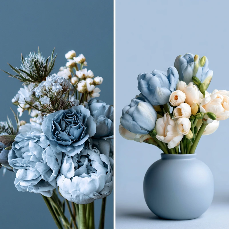
Pale blue is lighter and more straightforward, closer to a washed-out sky blue with fewer grey undertones. It reads sweeter and more casual than dusty blue, and tends to wash out in low-light indoor settings where dusty blue holds its own.
Dusty Blue vs Ice Blue
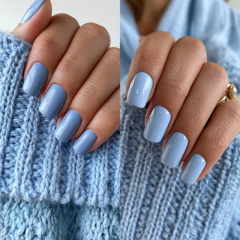
Ice blue is cooler, crisper, and almost silver-adjacent. It can look stunning in bright natural light but reads very cold in dim or amber-heavy indoor venues. Dusty blue has more warmth and depth, which makes it more adaptable across venue types.
Dusty Blue vs Powder Blue
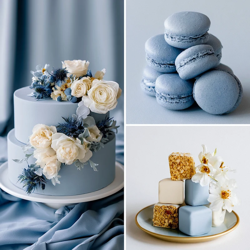
Powder blue is soft and sweet, sitting closer to the pastel family. It has less grey influence than dusty blue and a more delicate, romantic quality. Dusty blue is the more grown-up, editorial version of the same color family.
Is Dusty Blue a Good Wedding Color?
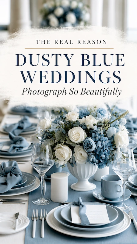
Yes, and here’s why it works so well across such different weddings. Before you commit, though, it helps to ask yourself a few honest questions:
What’s your venue’s natural palette?
Dusty blue thrives in venues with neutral or warm tones, natural light, and organic textures: garden estates, barn venues, vineyard spaces, light-filled ballrooms. In very dark or jewel-toned venues, pair it with deeper accents like burgundy or navy to stop it getting lost.
What season are you marrying in?
Dusty blue is genuinely season-agnostic, which is rare. It reads fresh and airy in spring and summer, and quietly romantic in fall and winter. How you style it changes considerably by season, and we cover each one in detail below.
What’s your metallic preference?
Dusty blue is a natural partner for silver and pewter. It also works with gold, but the combination skews warmer and slightly more rustic. Rose gold needs careful styling to avoid clashing.
Does it need to work across a full wedding party?
Dusty blue is one of the more flattering wedding colors across a broad range of skin tones. For detailed bridesmaid and wedding party guidance, see our dedicated guide linked at the end of this article.
The bottom line is this: if you want a wedding color that photographs beautifully, pairs with nearly everything, feels current without being trendy, and works beautifully across a full wedding design, dusty blue is a genuinely great choice.
Best Dusty Blue Wedding Color Combinations
The colors you build around your dusty blue will determine whether your wedding feels romantic and lush, cool and ethereal, earthy and organic, or clean and modern. Here are the pairings that consistently work.
Dusty Blue and White
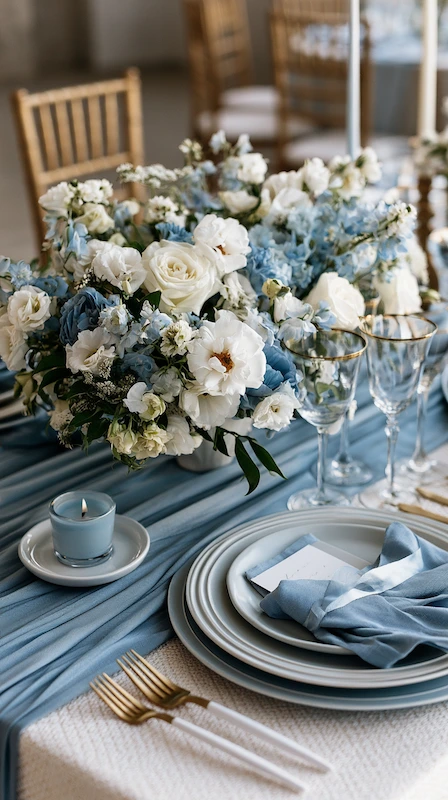
This is the combination that never misses. White acts as a visual reset between elements, keeping the palette feeling fresh and intentional rather than heavy.
Where it shows up:
- White linen tablecloths under dusty blue napkins
- White ceramic charger plates against a dusty blue table runner
- White floral accents woven through a predominantly blue bouquet
- Crisp white stationery with dusty blue ink or ribbon details
Pro Tip: If your venue already has a lot of white in its walls or draping, swap your white accent for soft ivory. It warms the palette slightly and stops the space from reading too clinical.
The key to making this pairing work is texture. Matte white against a linen-weave dusty blue reads completely differently than glossy white against a satin dusty blue. Lean into contrast in finish and fabric.
Dusty Blue and Burgundy
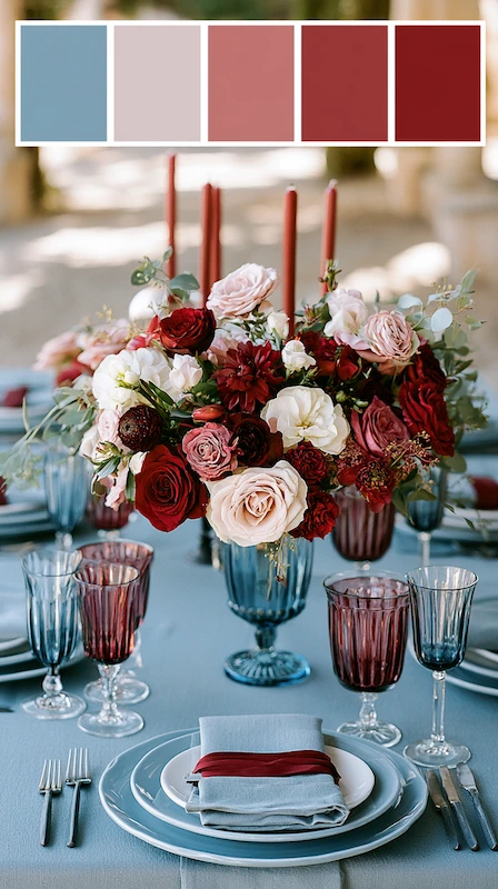
If you want depth, this is the combination. Burgundy is warm, saturated, and grounded. Dusty blue is cool, muted, and airy. That tension is exactly what makes the palette so visually compelling.
How to use it:
- Dusty blue as the dominant color, burgundy as a secondary accent in bouquets and florals
- Burgundy ribbon on dusty blue stationery
- Deep burgundy blooms nestled into dusty blue and white centerpiece arrangements
Key Takeaway: Keep burgundy as the accent, not the equal partner. When both colors compete for dominance the palette starts to feel heavy. Let dusty blue lead.
Dusty Blue and Greenery
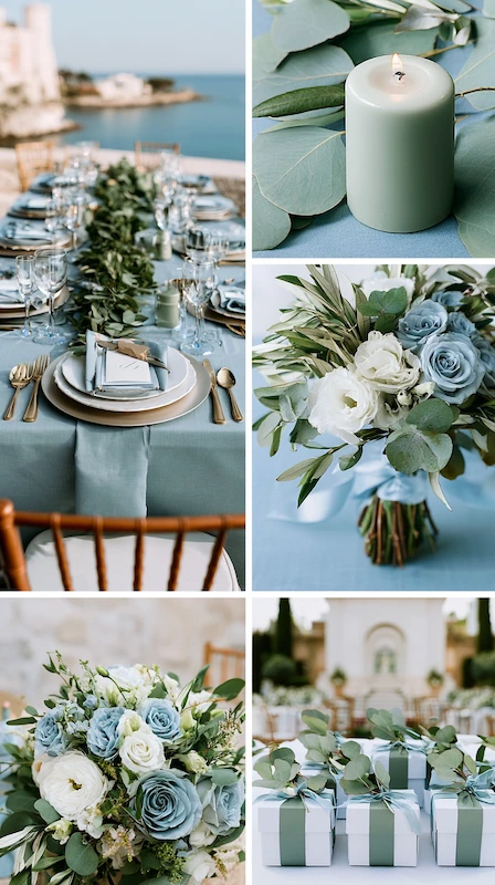
This combination makes a wedding feel like it grew there. The grey undertone in dusty blue echoes the silvery-green of eucalyptus leaves, which is why they look so naturally cohesive.
Where it shines:
- Long garland runners down reception tables with dusty blue linen underneath
- Ceremony arches built from greenery with dusty blue ribbon and white floral accents
- Loose, garden-gathered bouquets in dusty blue, white, and deep green
- Wedding favors tied with eucalyptus sprigs and dusty blue ribbon
Styling Hack: Dried pampas grass and preserved eucalyptus are excellent budget-friendly alternatives to fresh greenery for garlands and arch installations. They hold their shape all day without wilting.
Dusty Blue and Gold or Silver
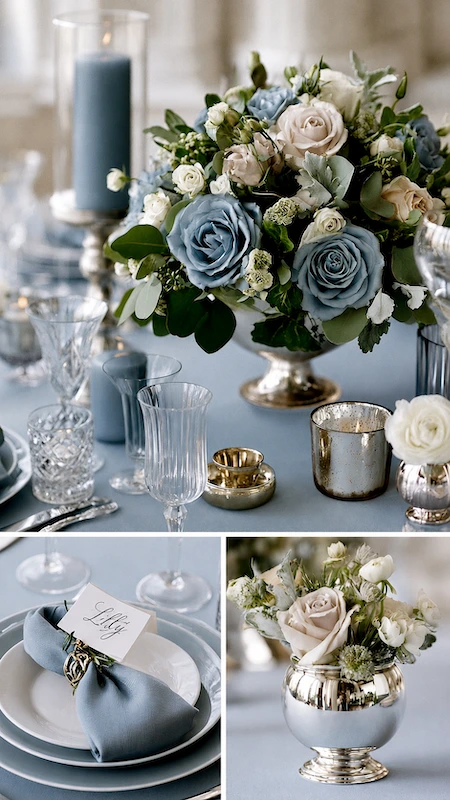
Your metallic choice shifts the entire mood of a dusty blue wedding, so this decision deserves more thought than most couples give it.
Silver and pewter are the natural partners. Gold works too, but pushes things warmer and more rustic. Here’s a simple way to decide:
- Silver and pewter: The natural partners for dusty blue. Cool undertones align perfectly. Reads as modern, refined, and quietly luxurious.
- Gold: Works, but pushes the palette warmer and slightly more rustic or boho. Antique or champagne gold integrates more gracefully than bright polished gold.
- Can’t choose? Use silver as your primary metallic and bring gold in through small details like place card holders or votive candle holders.
Expert Insight: Silver or gold lettering on dusty blue stationery is one of the most elegant combinations in the current wedding market. Silver lettering on a deep dusty blue envelope reads especially well in photos.
Dusty Blue and Grey
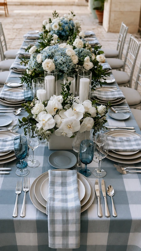
For couples drawn to a minimalist, contemporary aesthetic, dusty blue and grey is a genuinely underrated combination. It creates a palette that feels cohesive, sophisticated, and almost atmospheric in the right venue.
This combination works particularly well for:
- Urban venues, industrial spaces, and modern ballrooms
- Winter weddings where you want to lean into the cooler, quieter mood of the season
- Couples who want a neutral-leaning palette that still has a clear color identity
Trend Alert: The dusty blue, grey, and white combination has been showing up frequently in editorial wedding photography, particularly for minimalist and architectural venue settings.
Color Combos to Avoid With Dusty Blue
Not every color plays nicely with dusty blue. Know these before you fall in love with something on a mood board.
Bright or neon accents.
Dusty blue lives in a muted, desaturated world. Drop a bright coral, hot pink, or electric yellow into the mix and it immediately looks like a mistake rather than a contrast. You’re better off choosing a different primary hue entirely if you love bold color.
Royal blue or navy as a co-equal.
Too close in family, too different in saturation. Side by side they look like a color-matching error rather than an intentional palette choice. If you want multiple shades of blue, keep dusty blue clearly in the middle, with very light or very dark blues as accents only.
Warm orange or terracotta as a primary pairing.
Both are beautiful wedding colors individually. Together, the warm/cool tension is too pronounced and doesn’t resolve the way burgundy does alongside dusty blue. Steer toward sage green or warm linen tones instead.
Actionable Tip: Before finalizing your palette, order fabric swatches or paint chips and photograph them together in your venue’s natural light. Mood board colors can look very different from the real thing once you’re standing in your actual space.
How to Style a Dusty Blue Wedding by Season
Dusty blue doesn’t belong to any single season, which is one of the things that makes it such a strong wedding color.
But here’s the deal: how you style it should absolutely change depending on when you’re getting married. The same dusty blue that feels breezy and garden-fresh in May needs a completely different supporting cast in December.
Spring
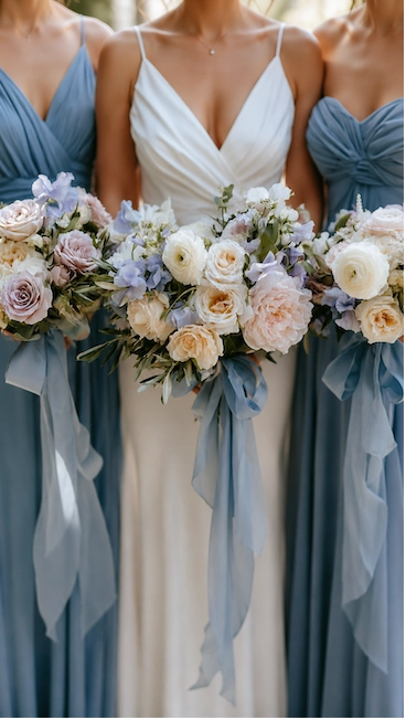
Spring is probably the most natural fit. The color mirrors exactly what’s happening outside: soft skies, new green growth, early blooms in cream and blush and lavender.
Spring styling moves:
- Loose, garden-gathered bouquets with dusty blue ribbon trailing at the stems
- Ivory or white linen tablecloths with dusty blue napkins and fresh floral garland runners
- Natural light venues, greenhouse spaces, or outdoor garden ceremonies where the color breathes
- Lightweight bridesmaid dress fabrics that photograph softly in spring light
Perfect Pairing: Dusty blue and blush is an unexpectedly lovely spring combination. The warmth of blush stops dusty blue from reading too cool. Use blush sparingly in your florals and let dusty blue carry the color story.
Spring is also the season where dusty blue works hardest in photos. The quality of spring light, especially in the late afternoon, wraps around muted, desaturated colors in a way that makes them glow.
Summer
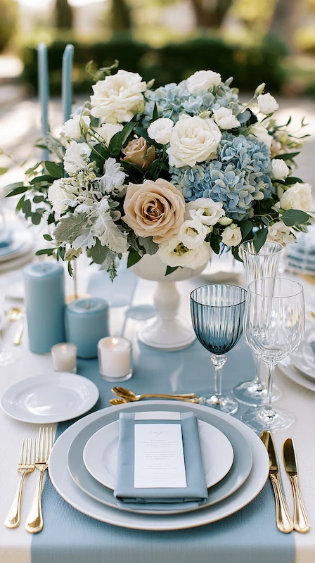
Summer light is high, harsh, and unforgiving to colors that are already muted. Here’s what I’ve learned from styling dusty blue weddings in peak summer: make sure your dusty blue is rich enough in saturation that it doesn’t wash out in direct midday sun. Photograph your fabrics and florals in outdoor daylight before you commit.
Summer styling adjustments:
- Choose florals with deep enough petals to hold their color in heat
- Keep table linen in white or very pale grey to reflect light rather than absorb it
- Opt for bridesmaid dresses in breathable, lightweight fabrics and avoid satin finishes
- Use greenery and white as generous buffers throughout your florals
Actionable Tip: For outdoor summer ceremonies, consider dusty blue and white parasols or fans as a practical guest favor. They serve a genuine function in the heat and photograph beautifully in processional shots.
Evening summer weddings are where dusty blue really comes into its own. As natural light softens into golden hour, the color deepens and takes on a richness it doesn’t always have in harsh daylight. If you have any flexibility in timing, push the ceremony to late afternoon.
Fall
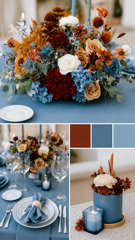
Fall is where dusty blue gets interesting. The warm, rich tones of autumn could easily clash with a cool blue, but dusty blue’s grey undertone acts as a natural bridge between warm and cool, making it work in ways that a brighter or more saturated blue simply couldn’t.
Fall styling moves:
- Pair dusty blue with deep burgundy, terracotta accents, and warm ivory rather than pure white
- Bring in dried grasses, amber foliage, and warm-toned florals alongside dusty blue ribbon and greenery
- Use warm candlelight throughout to counterbalance the cool blue
- Consider a slightly deeper, more saturated dusty blue for bridesmaid dresses
Expert Insight: The dusty blue and burgundy combination reaches its peak in a fall setting. The seasonal palette naturally reinforces both colors, and the overall effect feels intentional and editorial.
Winter
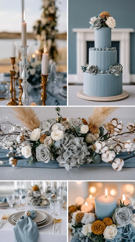
Winter is where dusty blue gets to be its most dramatic self. Candlelight, dark venues, bare branches, and the quiet stillness of the season all amplify what makes dusty blue so compelling.
Winter styling moves:
- Mix silver and antique gold candleholders for warmth against the cool blue
- Layer shades of grey and dusty blue on the table: grey linen base, dusty blue runner, grey and white florals with deep green accents
- Bring in dried and textural elements like pampas grass, cotton stems, and bare branches with small white fairy lights
- Use abundant candlelight throughout the reception to warm the cool blue palette
Expert Insight: Winter is the one season where I’d suggest auditing your venue’s existing lighting before finalizing your dusty blue shade. Some indoor venues have amber-heavy lighting that can make cooler tones look slightly muddy. In those cases, add more white and silver elements to counteract the amber cast.
Winter is also the season where dusty blue pairs most naturally with ice blue as a secondary tone. Dusty blue as the dominant color and ice blue woven through ribbon or floral accents creates a palette that feels deliberately seasonal without being clichéd.
Dusty Blue Wedding Ideas by Style
Here’s something most color palette guides won’t tell you: the color isn’t the style. Dusty blue is a hue, not an aesthetic.
How you deploy it is what creates the look and feel of your wedding. That’s why a boho dusty blue wedding and an elegant dusty blue wedding can use the exact same color and look like they belong in entirely different magazines.
Boho
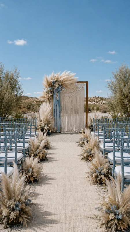
The boho dusty blue wedding is built on organic shapes, natural textures, and deliberate looseness. Nothing is too polished. Nothing is too symmetrical. The goal is a wedding that looks like it arrived naturally rather than one that was styled.
Boho styling checklist:
- Macramé ceremony backdrop in natural jute with dusty blue ribbon woven through it
- Pampas grass in the ceremony arch, on the table, and in the bridal bouquet
- Unstructured florals with trailing greenery, dried elements, and wildflowers in cream, white, and soft blue
- Low wooden or farm tables with dusty blue linen runners and mismatched candle heights
- Relaxed bridesmaid dress silhouettes in dusty blue
- Naked or semi-naked wedding cake with pressed dried flowers and blue ribbon at the base
Add Some Flair: Dried blue florals pressed into your stationery, vow books, or place cards is a beautiful detail that reinforces the boho palette without any extra budget. Many stationery designers offer this as an add-on.
The boho dusty blue wedding also tends to be the most forgiving aesthetically. Because nothing is meant to be perfectly matched, small inconsistencies in shade across different vendors actually add to the charm rather than detract from it.
Rustic
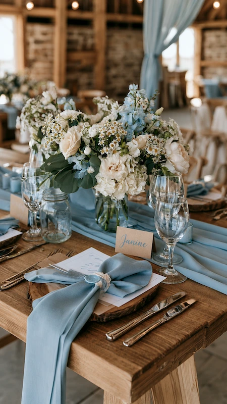
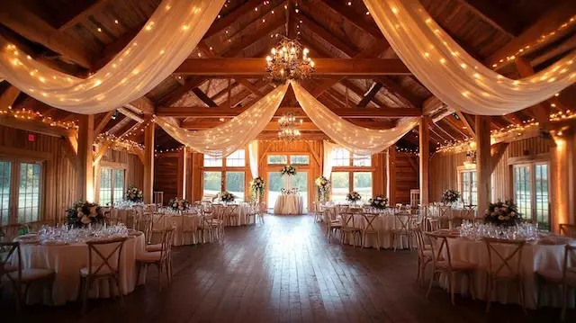
A rustic dusty blue wedding is more grounded and more connected to a specific sense of place: a barn, a farmhouse, a vineyard. Dusty blue works here because it provides a cool, polished counterpoint to warm wood, exposed brick, and natural stone. Let the venue provide the roughness. Let the color provide the elegance.
Rustic styling checklist:
- Wooden accents and live-edge details alongside dusty blue linen napkins
- Mason jars or antique milk bottles filled with wildflowers in cream, white, and dusty blue
- String lights or Edison bulb lighting overhead, which warms the cool blue beautifully in the evening
- Kraft paper stationery with dusty blue ink or wax seals
- Wooden wedding signs with dusty blue painted lettering
How-To: Stand in your venue and identify three dominant textures: wood, stone, brick, metal. Then make sure your dusty blue elements touch at least two of those textures directly. A dusty blue napkin on a wooden table, or a dusty blue ribbon on a stone arch, grounds the color in the space.
Elegant
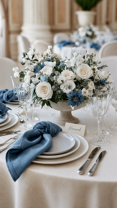
The elegant dusty blue wedding is one of the most current interpretations of the color right now. It’s the version showing up in editorial wedding publications. The approach strips everything back: fewer elements, higher quality, more intention.
Elegant styling checklist:
- Heavyweight matte ivory or white flax linen as your base: never polyester, texture matters enormously
- A single low, footed stone compote or antique silver bowl as the centerpiece vessel
- Dusty blue hand-loomed linen napkins draped off-center at each place setting
- Matte white ceramic charger plates that keep the table feeling airy and luminous
- Brushed silver or pewter flatware throughout, no mixed metals
- Minimal, typographic place cards in ivory with dusty blue or silver lettering
Favorite: The stone compote centerpiece vessel dictates an organic, sprawling arrangement shape while keeping sightlines clear for guests across the table. Antique silver bowls achieve the same effect with a slightly warmer feel.
The key distinction between elegant and the other aesthetics is restraint. Every element earns its place. That discipline is what makes an elegant dusty blue wedding feel truly sophisticated rather than just pretty.
Dusty Blue vs Light Blue Wedding
Before you finalize your color, it’s worth asking one practical question that often comes up late in the planning process: is your venue better suited to dusty blue or to a lighter, cleaner blue?
Choose dusty blue if:
- Your venue has neutral or warm tones in its walls, floors, and draping
- You’re working with abundant natural light, either outdoors or in a light-filled indoor space
- Your overall aesthetic is organic, textured, or editorial
- You want a color that reads as sophisticated rather than sweet
Consider a lighter blue if:
- Your venue is very dark or heavily draped, where dusty blue’s grey undertone may get lost
- Your aesthetic is more classic and traditional, where a cleaner blue feels more at home
- You’re working with a predominantly warm-toned palette where dusty blue’s cool undertones create friction
Key Takeaway: When in doubt, request fabric swatches from your linen vendor and take them to your venue. Hold them against the walls, floor, and any existing draping in both natural and artificial light. The right shade will look settled and intentional. The wrong shade will look slightly off in a way you can’t quite put your finger on. Trust that instinct.
Dusty Blue Wedding FAQ
Is dusty blue a good wedding color?
Yes. It photographs beautifully, works across every season, and pairs naturally with a broad range of colors and venue styles. It’s one of the most versatile wedding colors couples are using right now.
What colors go well with dusty blue for a wedding?
The strongest pairings are dusty blue and white, dusty blue and burgundy, dusty blue and eucalyptus greenery, dusty blue and silver or pewter, and dusty blue and soft grey. Each creates a different mood, from romantic and lush to cool and editorial.
Is dusty blue better for spring or winter weddings?
Both work well, but for different reasons. Spring lets dusty blue feel fresh and airy alongside garden florals and natural light. Winter lets it lean into its cooler, more dramatic qualities alongside candlelight and layered textures. The styling approach changes, but the color holds up beautifully in both seasons.
Does dusty blue work in rustic weddings?
Yes, and it works particularly well. Dusty blue acts as the refined element in a rustic setting, providing a cool, polished counterpoint to warm wood, exposed brick, and natural stone. Let the venue provide the roughness and let the color provide the elegance.
What metal looks best with dusty blue?
Silver and pewter are the natural partners. The cool undertones align perfectly. Gold also works but pushes the palette warmer and more rustic. Antique or champagne gold integrates more gracefully than a bright, polished finish.
What flowers go with a dusty blue wedding?
Soft blue blooms, white florals, and silvery greenery all work beautifully with dusty blue. For a full breakdown of bouquets, centerpieces, and ceremony flowers, see our dusty blue wedding decor guide.
Is dusty blue the same as powder blue?
No. Dusty blue has a grey undertone that gives it a muted, sophisticated quality. Powder blue sits closer to the pastel family, sweeter and softer with less grey influence. Dusty blue is the more grown-up, editorial version of the same color family.
Can dusty blue work in a formal ballroom wedding?
Yes, but it needs the right approach to styling. Lean into the elegant interpretation: heavyweight linen, brushed silver flatware, structured florals, matte ceramic charger plates, and minimal accessories. The key is restraint. Strip away anything that skews casual and let the color carry the sophistication.
Next Steps for Planning Your Dusty Blue Wedding
This guide covers the palette logic and styling decisions: what dusty blue actually is, which color combinations work, how to adapt it by season, and how to translate it into three distinct aesthetics.
That’s the decision-making layer sorted. The two guides below go deeper into execution, and they’re designed to pick up exactly where this one leaves off.
If you’re thinking about your wedding party, head to Dusty Blue Bridesmaid Dresses: How to Style Your Whole Wedding Party. That’s where the fabric, silhouette, groomsmen coordination, and bridal styling detail lives.
If you’re thinking about your venue and reception, Dusty Blue Wedding Decor: Florals, Table Settings, and Reception Styling covers the full place setting breakdown, floral design, stationery, wedding cake, and all the finishing details that bring the color to life on the day.
Save both to your planning folder. You’re going to want them.