Sage Green and Terracotta Wedding: The Earthy Duo That Understood the Assignment
A sage green and terracotta wedding is what happens when a sunset falls for an herb garden and the two of them decide to throw a party. One brings the warmth, one brings the calm, and together they create the kind of celebration that looks expensive in photos and feels relaxed in person. That combination is rarer than you would think.
If these two colors have been sitting at the top of your inspo folder for months, consider this your sign. Below is the full playbook: why the pairing works, how to split the colors so nothing clashes, space-by-space styling, the best seasons and venues, and the mistakes I keep seeing couples make with earth tones. (I have opinions. You are about to hear them.)
Steal the Exact Shades (Screenshot This Part)
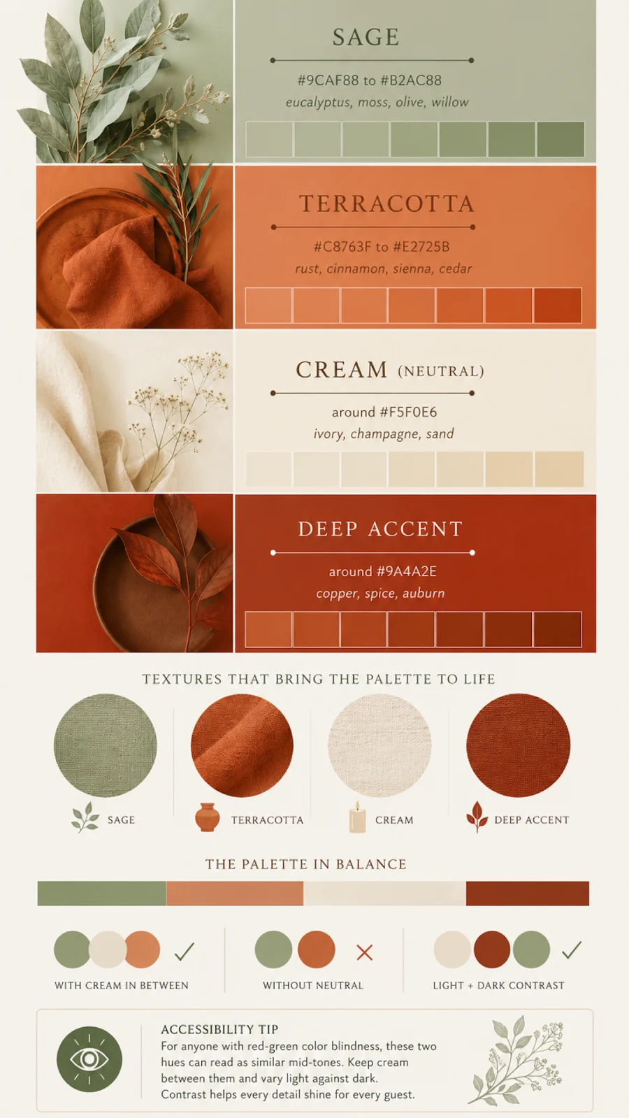
Before anything else, here are the specs to hand your vendors and to type into retailer search bars. Screens and fabrics vary, so treat these as the center of the target rather than the bullseye:
| Shade | Hex range | Retailer search terms that find it |
|---|---|---|
| Sage | #9CAF88 to #B2AC88 | eucalyptus, moss, olive, willow |
| Terracotta | #C8763F to #E2725B | rust, cinnamon, sienna, cedar |
| Cream (your neutral) | around #F5F0E6 | ivory, champagne, sand |
| Deep accent | around #9A4A2E | copper, spice, auburn |
One thoughtful extra: for anyone with red-green color blindness, these two hues can read as similar mid-tones. Keep cream between them and vary light against dark, and the design sings for every eye in the room.
That is the whole palette. Everything below is how to use it.
Why Terracotta and Sage Work So Well Together
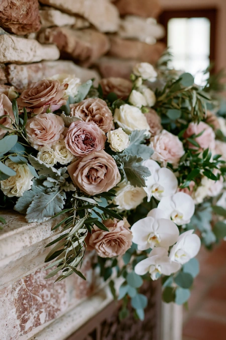
Terracotta is a muted, earthy orange with clay undertones. Sage is a dusty, gray-washed green. Orange and green sit far enough apart on the color wheel to create real contrast, but because both shades are softened with gray, the contrast never shouts. You get energy without chaos, which is exactly what you want in a room full of your closest 120 people.
A little symbolism, free of charge: the green half of this palette takes its name from an herb the Old Farmer’s Almanac notes has long been called the herb of wisdom. Building your big day around the color of wisdom? On brand.
The data backs up your taste, too. According to The Knot 2025 Real Weddings Study, which gathered responses from nearly 17,000 newlyweds, 33 percent of couples wove light green shades like sage into their day, and among Gen Z couples that number climbs to 38 percent. Adding the clay half is how you take the third most popular hue in the country and make it feel like nobody else has ever done it.
Trend Alert: Earth tones have moved from trend to permanent resident. If you love this lane but lean cooler, the dusty blue and sage green pairing guide covers the moody-soft version of the same idea.
New to the green side entirely? Start with the full sage green wedding theme guide, then come back here for the full two-tone upgrade.
Get the Ratio Right Before You Buy a Single Napkin
Here’s what I’ve learned after styling this palette more times than I can count: the couples who love their photos picked a lead color, and the couples who don’t went 50/50. But here’s the catch: split these two evenly and the room starts arguing with itself. Neither shade wins, and everything reads busy.
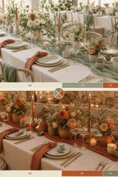
You have two good options:
- Sage leads, terracotta accents. Roughly 60 percent soft neutrals like cream and sand, 30 percent sage, 10 percent terracotta. The result is airy, garden-fresh, and romantic. The clay tones show up in your wedding decor, in the napkins, florals, and taper candles, like a plot twist.
- Terracotta leads, sage supports. Flip the middle numbers and you get something warmer and bolder, closer to boho and desert-at-dusk. The green becomes the exhale between all that warmth.
Key Takeaway: Pick one shade to lead and let the other support. That single decision does more for your photos than any individual purchase you will make. The same logic drives every combination in this roundup of wedding color palettes that actually work.
Bonus: This palette is quietly kind to your budget. Clay vessels, dried stems, amber glass, and greenery-heavy arrangements tend to cost less than dense, bloom-only designs, and most of the signature pieces can be thrifted, borrowed, or resold after the big day. Earthy and economical is a rare double win.
How to Style a Sage Green and Terracotta Wedding, Space by Space
Now for the part you actually came here for. Here is how the palette plays out area by area, from the aisle to the last signature cocktail.
Start at the Ceremony
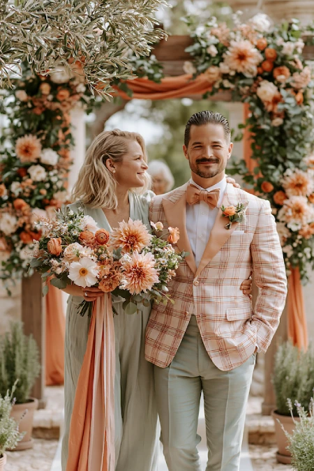
Your ceremony sets the color story, so introduce both shades right away:
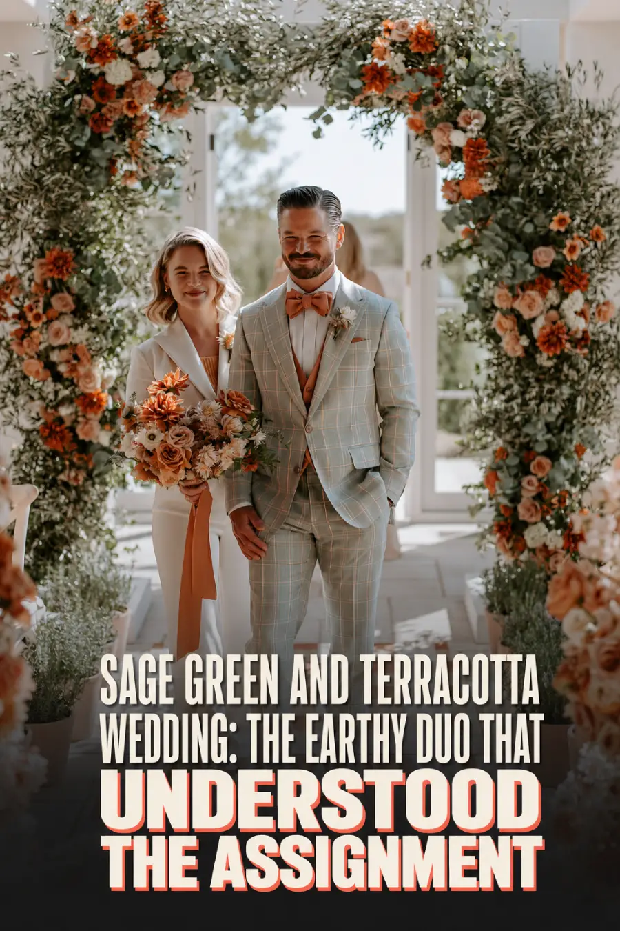
- An arch or arbor of olive branches and eucalyptus with rust and toffee blooms tucked in
- Clay pots of rosemary or lavender lining the aisle (they cost less than cut florals and go home with your family after)
- A cream aisle runner so both colors pop against it in photos
Pro Tip: Those aisle pots are the hardest-working item at the whole event. Ceremony first, then someone moves them to the cocktail hour, then they become favors. Three jobs, one prop. Give them a raise.
Build the Reception Tables Backwards
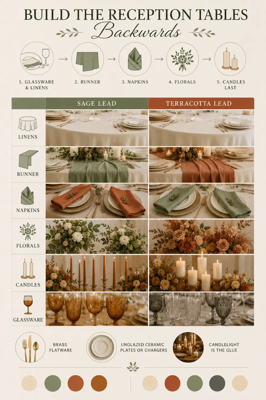
The prettiest tables in this palette start with the base layers, not the centerpiece. The full guide to building a wedding tablescape backwards explains the method, but the short version: glassware and linens first, florals last.
Here is the color recipe both ways, depending on which shade leads:
| Element | Sage Lead | Terracotta Lead |
|---|---|---|
| Linens | Cream | Cream |
| Runner | Muted green | Clay |
| Napkins | Clay | Muted green |
| Florals | Greenery heavy | Rust heavy |
| Candles | Amber tapers | Ivory pillars |
| Glassware | Amber | Smoke or clear |
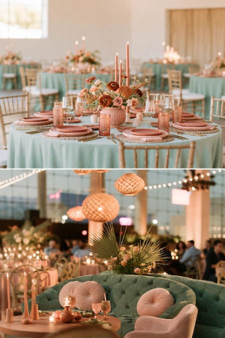
Round it out with brass flatware and unglazed ceramic plates or chargers (the oversized base plates under each setting). Candlelight is the glue: it warms the clay and deepens the green at the same time.
Styling Hack: Order swatches of your exact linens and look at them at your venue in the evening. Both of these colors shift under warm lighting, and a five-minute swatch test beats a very long email chain with your rental company later.
Give the Florals Some Texture
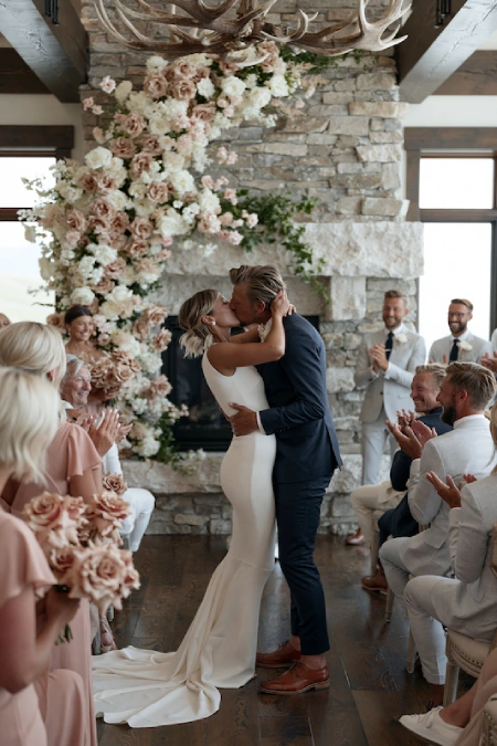
This palette was practically invented for florists. Ask for:
- Toffee roses, burnt orange ranunculus, and rust dahlias
- Eucalyptus, olive foliage, and dusty miller for the green side
- Dried elements like palms, bunny tail grass, and pampas for texture
A bouquet built from those ingredients photographs like golden hour in plant form. Keep the bridesmaids’ versions smaller and heavier on greenery so yours stays the main character.
And the money question, because someone in your planning circle is already asking it: what does this look cost? Every market prices differently, so treat this as a relative scale rather than a quote, and ask your florist to bid all three ways:
| Floral approach | Relative cost |
|---|---|
| Greenery-heavy with clay accents | $ |
| Balanced fresh blooms and foliage | $$ |
| Premium full floral installations | $$$ |
The palette’s secret weapon: the $ column actually looks intentional here, because greenery and dried texture are the aesthetic, not the compromise.
Dress the Wedding Party
Terracotta bridesmaid dresses are the move if clay is your lead color, and here is the fun part: they do not need to match. Mixed shades of rust, cinnamon, and clay look intentional and let each person pick a flattering cut. If green is your lead, put the dresses in sage and hand everyone rust-toned florals instead.
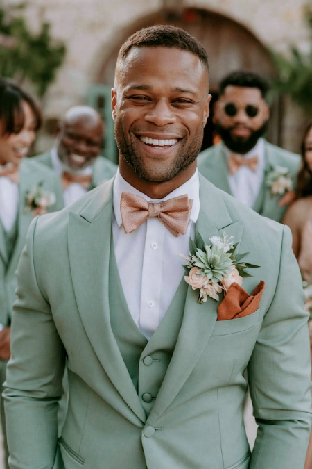
For the groom and groomsmen, a sage suit is a confident choice, and a tan or cream suit with a rust tie is the safer one that still lands. Either way, the bridal party will look like a curated album cover, in the best way.
Want more mileage from the menswear and the rest of the crowd? The quick menu:
- Tuxedos: a classic black tuxedo plays surprisingly well here; let a rust pocket square or boutonniere do the talking. Espresso brown is the bolder move for outdoor venues.
- Ties and bow ties: rust, cinnamon, olive, and toffee all land. Match the depth to the season, lighter in June, deeper in October.
- Pocket squares: cream with a rust edge, or a muted pattern that picks up both sides of the palette.
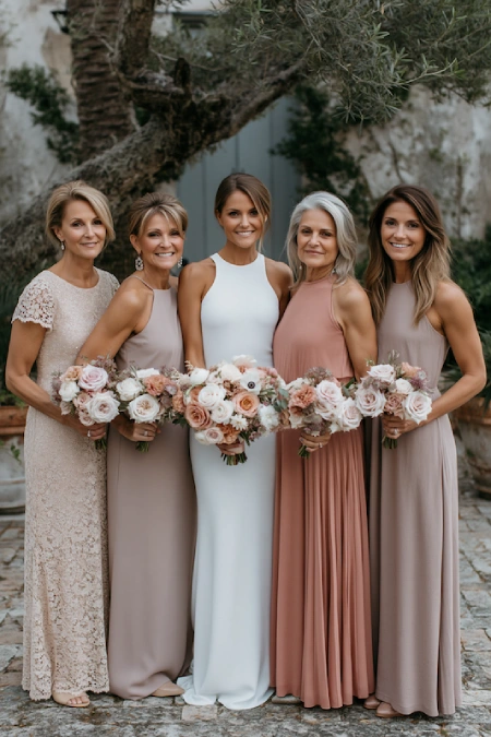
- Mothers of the couple: champagne, taupe, dusty rose, or deep olive; the FAQ below has the full rundown.
- Guests: if you share attire guidance, warm neutrals, olive, and dusty rose photograph beautifully. Just steer everyone away from bright orange and neon.
Sweat the Details Guests Screenshot
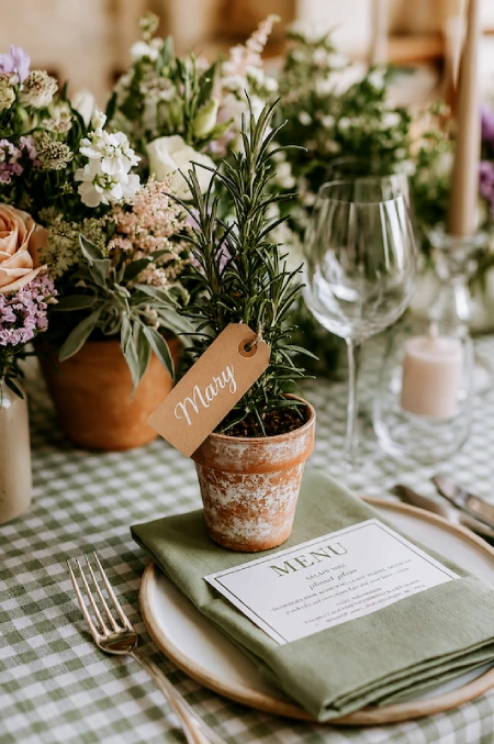
This is where the palette gets its wow moment. My favorite: an escort card wall of mini clay pots, each planted with a sprig of rosemary or a tiny succulent, with guests’ names and table numbers on kraft tags. It is a seating chart, a favor, and the most photographed corner of your cocktail hour all at once.
Carry the colors through the paper goods too: cream card stock, sage ink, and a rust wax seal. Even your bar can join in. An Aperol spritz is basically terracotta in a glass, and a cucumber-mint cooler covers the green team.
The cake wants in too. An ivory buttercream base with clay-toned sugar blooms and a few eucalyptus sprigs ties the whole story together, no extra rentals required.
Expert Insight: If you do the clay pot escort display, alphabetize the tags and assign one member of the family to guard the alphabet. Guests will rearrange those pots like it is their job. Ask me how I know.
The Best Season for This Palette (Spoiler: Almost All of Them)
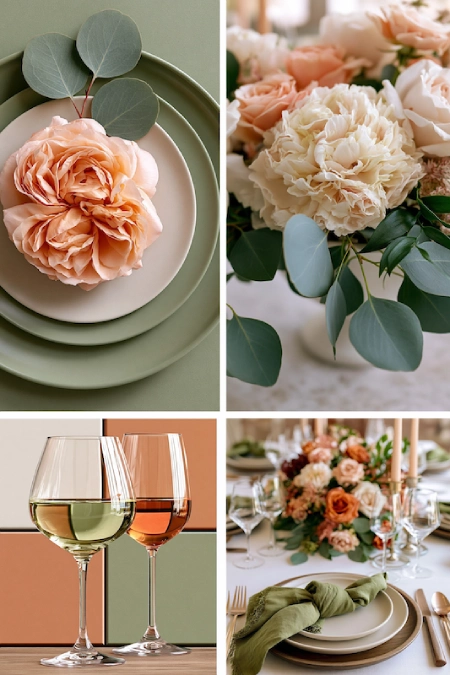
This combination is one of the most season-proof wedding color schemes out there. You just adjust the mix:
| Season | How to lean in |
|---|---|
| Spring | Let the green lead, keep the clay tones light, add soft blush blooms |
| Summer | Add extra cream and linen texture so the palette breathes |
| Fall | Deepen the warm side toward rust and copper; this is its peak era |
| Winter | Add burgundy, walnut wood, and double the candlelight |
Fall is the natural habitat, no surprise, since the trees essentially match your linens for free. But this is not a costume, it is a palette, and it works in April just as well as October.
Venues That Make These Colors Sing
Earth tones love venues with natural texture. The short list:
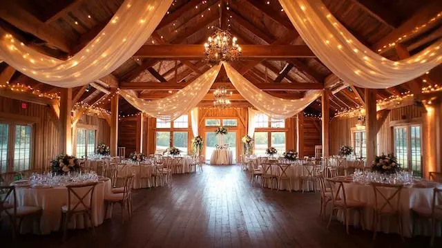
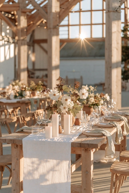
- Barns and farms. Warm wood plus sage plus clay is a cheat code. These barn wedding ideas show how far the look can go, and these rustic centerpieces slot straight into the palette.
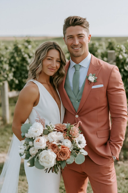
- Vineyards and gardens. The landscaping does half your styling for free.
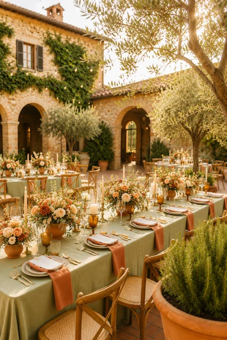
- Tuscan-style courtyards. Terracotta tile, olive trees, golden light. It’s giving Tuscany, because it literally is Tuscany’s whole thing; this Italian inspired wedding guide leans into exactly that energy.
- Modern and ballroom spaces. Yes, it works indoors. Keep the warm tones in velvet and ceramic rather than anything too crafty, and the palette reads elevated instead of rustic.
Accent Colors That Play Nice
You need a third and fourth player to round things out. The friendliest additions:
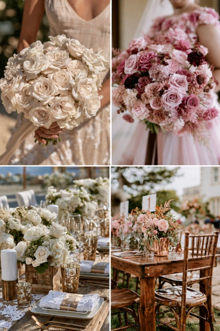
- Cream and ivory: the non-negotiable neutral base
- Dusty rose: softens the whole palette toward romantic
- Mustard: adds a playful, retro kick for fall dates
- Brass and gold: the metals that flatter both shades
- Walnut and warm wood tones: furniture and signage that blend in beautifully
Perfect Pairing: Cream linens with brass candlesticks is the supporting cast this duo deserves. It never competes, it just makes everything glow.
Skip bright white, which turns stark next to earth tones, and cool silver, which fights the warmth. Neon anything is a felony in this palette. (That was a joke. Mostly.)
Mistakes to Skip
A few things I would gently pull out of your cart:
- Swapping terracotta for bright orange. The real thing is baked clay, not traffic cone. Saturation is the whole difference.
- Matching every element to one exact swatch. Vary the shades: clay, rust, and cinnamon on the warm side, moss, olive, and eucalyptus on the green side. Perfectly uniform color reads flat in photos.
- Overdoing the boho props. A little macrame is charming. A macrame flash mob is not. The palette itself is doing the aesthetic work; trust it.
- Ignoring the lighting. Clay tones can drift pink or brown under certain bulbs. That’s why the swatch test at your actual venue matters more here than with almost any other wedding color story.
You’re better off buying fewer, better things in the right shades than filling every surface. Restraint is what separates earthy-elegant from theme-party.
FAQ
Is a sage green and terracotta wedding still on trend for 2026?
Yes, and it has outgrown trend status. Green tones have ranked among the most-used shades for years in The Knot’s data, and terracotta keeps it from feeling expected. Many couples find it ages far better in photos than high-saturation palettes.
What colors go with terracotta and sage?
Cream, ivory, dusty rose, mustard, and brass or gold metals are the safest companions. Burgundy joins the party for winter dates.
Are terracotta bridesmaid dresses hard to coordinate?
The opposite: mismatched shades of rust, clay, and cinnamon are the intentional look, so nobody needs to hunt down one exact dye lot (the same fabric batch from the same vendor).
Can I pull this off with faux florals?
Yes, and better than with most palettes. Dried stems already read premium, and rust and toffee tones are among the most convincing shades in silk blooms. Mix one fresh element, like real eucalyptus, into faux arrangements and nobody will clock the difference.
What should the mothers of the couple wear?
Champagne, taupe, dusty rose, or a deeper olive all sit beautifully next to the wedding party without copying it. Send them the swatch table above and let them pick what they feel best in.
Is sage green and terracotta too fall for a summer wedding?
Not at all. Lighten the mix: more cream, breezier linens, and the clay tones kept to small doses like napkins and taper candles. The season table above shows the summer formula; think apricot rather than rust.
What flowers are naturally terracotta colored?
Toffee and caramel roses, ranunculus, dahlias, marigolds, and zinnias all grow in warm clay shades, no dye needed. Dried palm fronds and preserved foliage extend the look for less.
What metals work best with this palette?
Brass, gold, and copper flatter both sides of the duo. Cool chrome and bright silver fight the warmth, so keep them out of the flatware and frames.
Does sage green work with black tuxedos?
Yes. A black tuxedo against the green with cream florals reads sharp and formal; add a rust boutonniere so the look ties back to the rest of the day.
Does this palette work for a formal or black-tie venue?
Yes, with material upgrades: velvet ribbon, ceramic vessels, brass details, and deeper rust tones read formal, while raw kraft paper and burlap read casual. Same colors, different fabrics.
Can I use this palette indoors?
Absolutely. Warm bulbs and plenty of candles are the trick, since cool overhead lighting flattens both hues. If the room allows it, amber uplighting makes the whole space glow.
The Bottom Line
This palette works because it balances itself: warm meets cool, bold meets calm, sunset meets herb garden. They fell for each other for a reason. Pick your lead color, keep your neutrals creamy, vary your shades, and test everything under real light.
Save this guide, send it to the group chat, and start with the ratio decision before you buy a single thing. Everything else gets easier from there. That is my sage advice, and yes, the pun was premeditated. I regret nothing.