25 Pastel Wedding Theme Ideas That Look Modern and Fresh
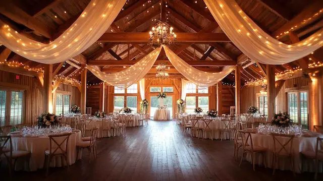
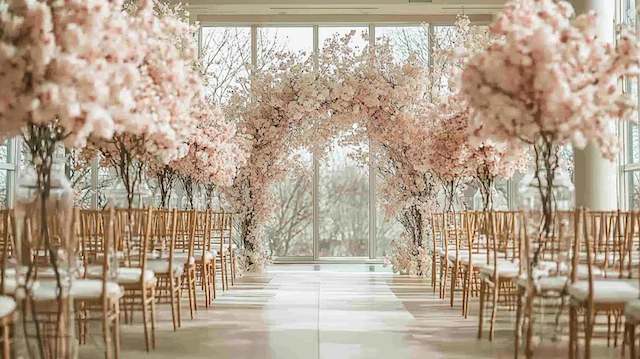
A pastel wedding theme works when the softness feels intentional: a clear color palette, repeated details, and enough contrast that every element stays crisp in photos. Pastels can be romantic, editorial, or playful depending on your textures (linen, glass, ribbon), lighting, and a single consistent accent, often a subtle metallic finish.
This list is designed for quick scanning, but each idea includes practical styling notes so you can actually plan and execute. Use it as wedding inspiration: pick 5–8 ideas that fit your venue, season, and personal style, then repeat them consistently for a cohesive look.
Table of contents
- Pastel wedding color palette ideas
- Ceremony & reception décor ideas
- Florals, bouquet & centerpiece styling
- Bridal party style
- Invitations, stationery, cake & guest details
- Quick checklist
Pastel wedding theme color palette ideas (1–6)
1) Blush pink + ivory + soft sage (modern romantic)
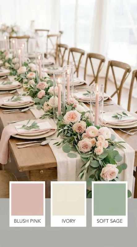
This is a go-to pastel wedding look because it feels gentle but still grown-up when ivory stays dominant and blush pink appears in small, deliberate placements. Sage keeps the palette grounded and pairs beautifully with candlelight.
- Best for: airy venues, tents, gardens, daytime celebrations
- Where to use color: napkins, ribbons, a few blooms, bar menu
- Photo tip: add contrast with black calligraphy or deeper greenery
2) Dusty blue + pale pink + silver (airy and elevated)
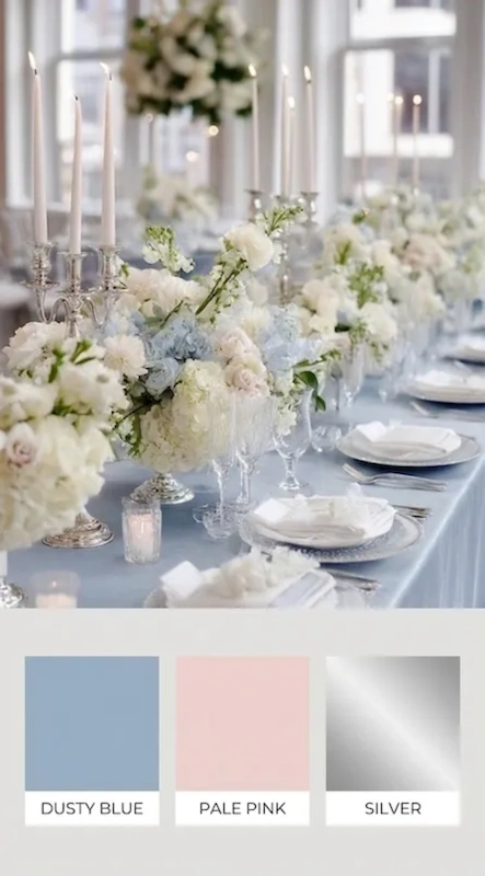
If you want softness with a polished edge, this wedding color direction is hard to beat. Use dusty blue as the anchor (linens, bridesmaids, or stationery) and let pale pink float in through florals and small paper details. Silver reads clean and modern rather than overly warm.
- Best for: clean white venues, lofts, modern ballrooms
- Easy upgrade: silver candleholders + sleek menus
- Keep it fresh: avoid too many extra colors, let texture do the work
3) Light blue + butter yellow + white (fresh for spring and summer)
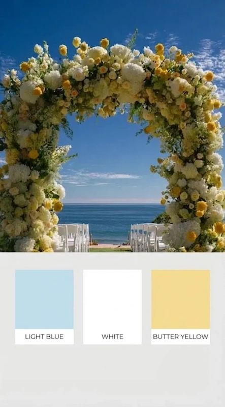
A light blue base feels calming and classic, while soft yellow adds a happy glow. This is especially flattering in natural light and reads bright without feeling loud, ideal for spring and summer celebrations.
- Best for: daytime ceremonies, coastal venues, airy outdoor spaces
- Trending detail: a yellow signature drink and a blue menu card
- Balance tip: keep florals mostly white with pops of yellow
4) Pastel purple + blush + champagne (garden wedding magic)
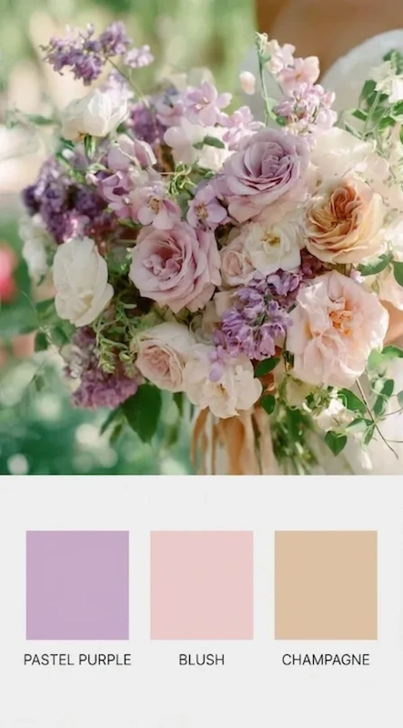
Pastel purple is having a moment again, especially in floral-forward designs that feel romantic and a little whimsical. Champagne accents add warmth and prevent the palette from leaning too cool, perfect for a garden wedding where greenery frames everything naturally.
- Best for: lush landscapes, courtyards, greenhouses
- Where it shines: bouquets and centerpieces rather than linens
- Pro move: keep signage typography modern to avoid a “themed” feel
5) Pastel pink + warm neutrals + one pop of color (current and playful)
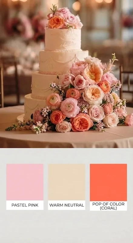
This approach keeps pastel pink modern: build your base with warm neutrals and add a controlled pop of color (coral, raspberry, or apricot) in one or two focal moments only. It reads curated, like a styled shoot, without being fussy.
- Best for: couples who want soft color with personality
- Use the pop here: bar signage, escort display, or a statement arrangement
- Avoid: repeating the pop everywhere (that’s when it gets busy)
6) Icy pastel hues + bright white + sparkle (a winter-ready twist)
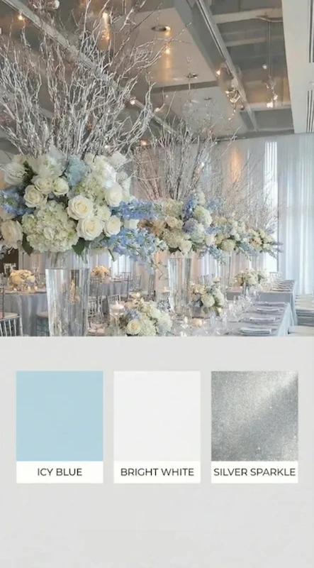
Pastels can look incredible for a winter wedding when you increase contrast. Think bright white linens, clear acrylic signage, and cool sparkle that adds dimension without darkening the palette. This is a clean, modern take on pastel shades.
- Best for: indoor venues, candlelit ceremonies, evening receptions
- Lighting tip: use warm pin-spot lighting on tables so color doesn’t fade
- Style note: keep greenery deep to outline the soft tones
Ceremony & reception décor ideas (7–16)
7) A ceremony arch with negative space (editorial and modern)
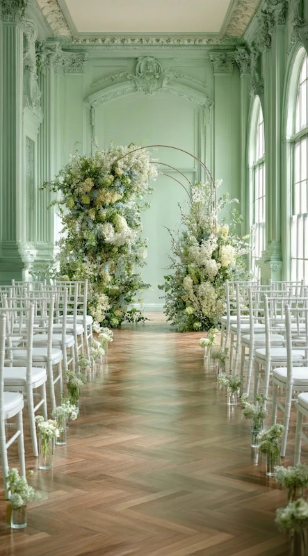
Instead of covering the structure, let the arch shape show and use two intentional floral clusters. This creates a focal point for the wedding ceremony that feels contemporary and also helps your budget, less product, more design.
- Placement: keep florals asymmetrical and slightly off-center for a modern look
- Color rule: pull from your main palette and repeat one tone in the aisle
- Bonus: repurpose the arch flowers behind the sweetheart table later
8) Aisle styling with bud vases and single stems
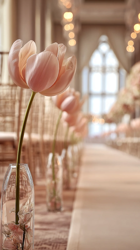
For a minimalist look that still feels romantic, line the aisle with clear bud vases and single stems in your palette. Add dimension by varying vase heights and spacing rather than adding more flower types.
- Works well with: clear glass, modern chairs, outdoor ceremonies
- Flower choice: choose one bloom type for cohesion (like rose or tulip)
- Practical tip: place vases slightly off the aisle edge to protect them from foot traffic
9) A welcome sign with one large floral arrangement
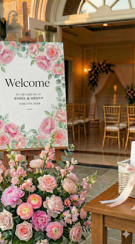
Guests interact with your welcome moment immediately, so it’s a smart place to invest. A grounded floral arrangement next to the sign sets the tone and becomes a built-in photo spot.
- Pair with: a small basket of programs or a simple map of the venue
- Make it readable: high-contrast lettering (black, navy, or deep green)
- Design tip: repeat one flower used in your bouquet for continuity
10) Powder blue tablecloths and napkins (a trending reception move)
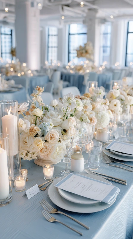
If you want the room to read pastel from across the space, commit to colored linens. Powder blue tablecloths and napkins create instant softness and feel very current when paired with clean plates and modern stationery.
- Best with: white plates, minimal menus, streamlined flatware
- Centerpiece approach: keep florals low and airy so tables don’t feel heavy
- Lighting: candle clusters add warmth and depth to cool blues
11) Pastel glassware that makes the table feel curated
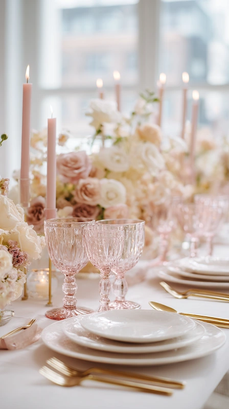
Colored glass is a high-impact detail that reads intentional in photos. Try pale pink stemware for romance, or go cooler with frosted blue goblets for a clean, modern look.
If you want more presence, choose goblets with a thicker rim or sculptural shape.
- Keep it modern: choose one glass color per table (not a rainbow)
- Pairing tip: match candle color to the glass tone for cohesion
- Budget tip: use colored glasses only at head table and sweetheart table
12) Pastel Tablescape Rentals (soft color, elevated feel)
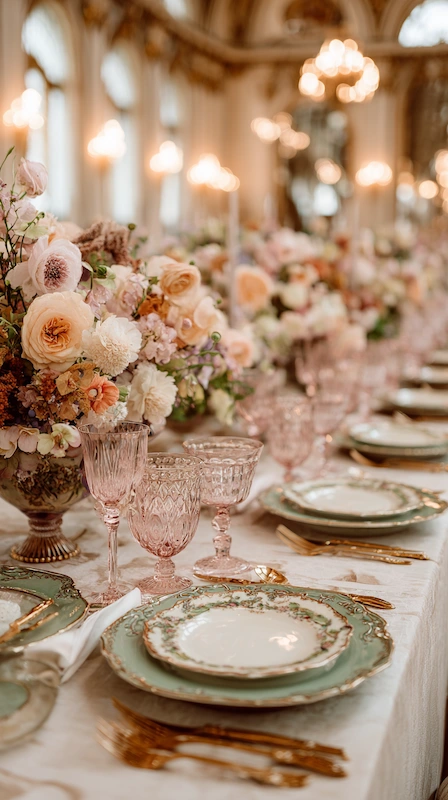
If you want a beautiful pastel wedding tablescape without adding extra décor, rentals are your best friend. Pastel glassware and vintage-inspired dinnerware add color through shape and finish, subtle, stylish, and camera-ready.
- Best for: garden-to-ballroom transitions, romantic modern styles
- Design trick: keep charger plates neutral so dinnerware stands out
- Avoid: mixing too many patterns (one signature pattern is enough)
13) The “Copy-Paste” Centerpiece Formula (Consistency = Luxury)
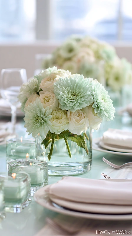
The easiest way to make wedding centerpieces look expensive is consistency. Choose one repeatable format and vary the flowers slightly by table so it feels organic. This also keeps your rentals and setup time efficient.
- Simple formula: bud vases + low arrangement + candles
- Table balance: leave space for menus and glassware to show
- Style note: use one main tone to tie the room together
14) Design Your Glow: Candlelight That Makes Pastels Pop at Night

Soft color can disappear under overhead lighting, so build glow into the plan. Candlelight gives your pastel wedding centerpieces depth and makes skin tones look warmer in reception photos.
- Mix heights: tea lights + tapers for a layered look
- Safety: check venue rules for open flame and hurricane sleeves
- Photo-friendly: place candles slightly inward so they frame the florals
15) Dusty blue escort cards with crisp typography
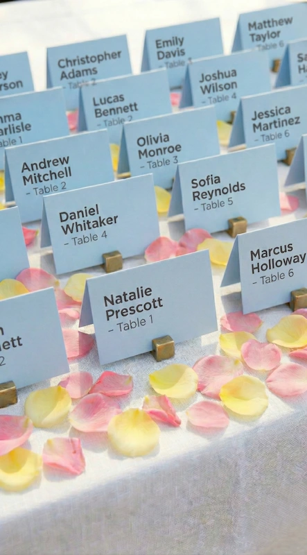
An escort display is a high-visibility styling moment that’s easy to execute. Dusty blue escort cards look especially modern with white ink or black calligraphy, and they tie your palette to guest flow.
- Display idea: clip cards to a grid wall or hang them on ribbon
- Keep it legible: avoid pale ink on pale paper
- Coordination: match card tone to a napkin or linen shade
16) A wedding lounge in soft pastels and neutrals
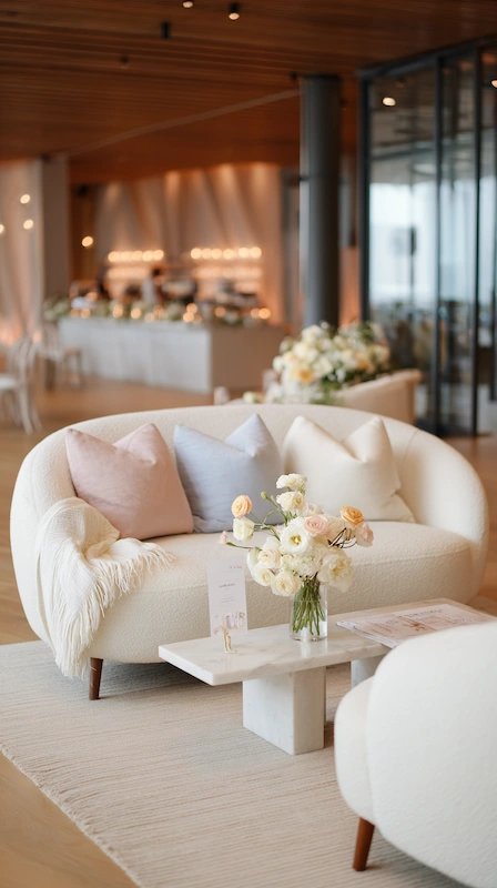
A styled wedding lounge makes a reception feel intentional and gives guests a comfortable place to gather. Keep furniture neutral and bring in pastel tones through pillows, throws, and a small arrangement.
- Placement: near the bar or dance floor so it stays lively
- Texture tip: boucle, linen, and velvet photograph especially well with pastels
- Finishing touch: add a small menu sign for the lounge bar area
Florals, bouquet & centerpiece styling (17–20)
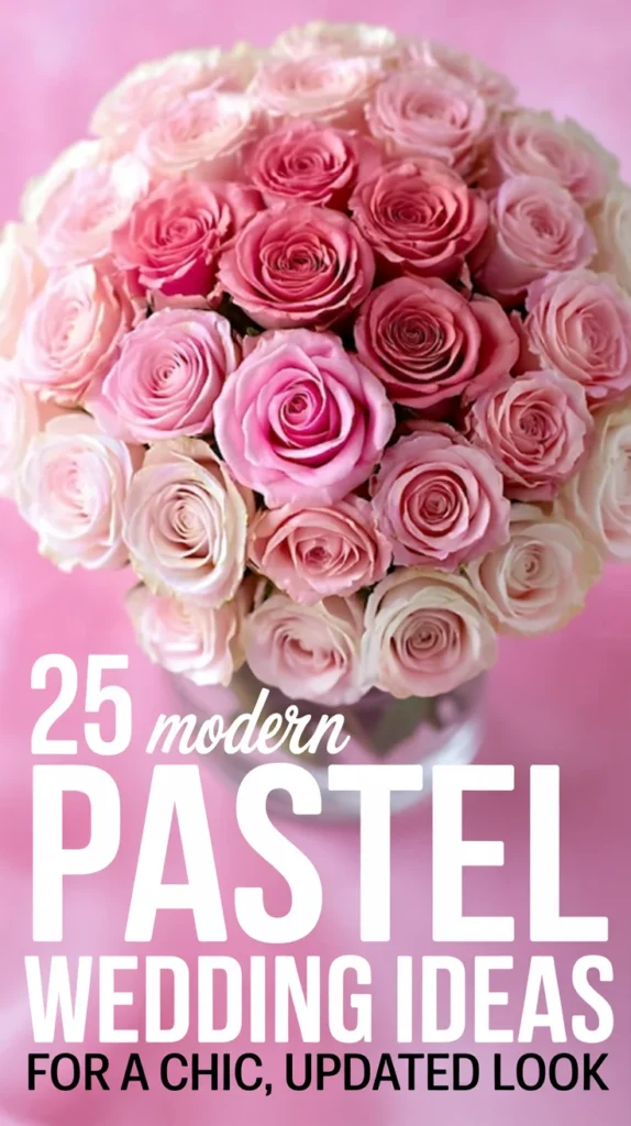
17) An ombré bouquet (soft fade, big photo impact)

An ombré bouquet uses color in a way that looks styled without being overdone: light tones at the edges, deeper tones toward the center. It also helps you incorporate multiple colors while keeping your overall hue story cohesive for portraits.
- Ribbon choice: choose a matte ribbon in a neutral or the lightest tone
- Shape: slightly airy and asymmetrical reads modern
- Coordination: echo one bouquet bloom in your centerpieces
18) Pastel florals with texture (the “pretty pastel” upgrade)

The most current pastel looks rely on texture more than quantity. Ask your florist for movement: ruffles, delicate sprays, and layered greens. That’s the difference between “soft” and pretty pastel styling that feels editorial.
- Texture ideas: sweet peas, ranunculus, garden roses, airy foliage
- Color strategy: include a slightly deeper tone to outline the lighter ones
- Best practice: keep floral colors within your palette even if blooms vary
19) Wedding flowers with clean “color blocking”
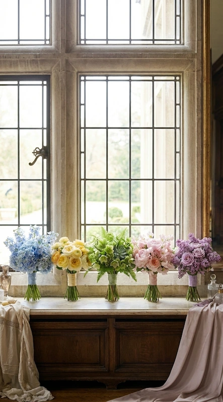
Color blocking is a simple way to make wedding flowers look modern: one arrangement leans pink, another leans blue, another leans lavender, still within the same palette. It adds variety across the room without looking chaotic.
- Where it works: bridesmaid bouquets, bud vases, and bar arrangements
- Keep it cohesive: repeat one neutral bloom (like white rose) across all pieces
- Design tip: use the same vase style for every color-blocked cluster
20) Minimal table clusters using single-stem blooms
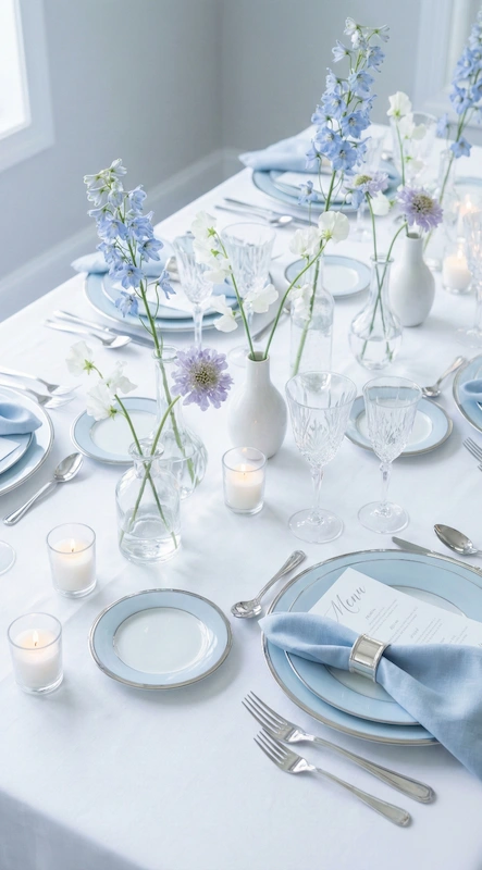
If you want a lighter look (or you’re working with a tighter floral budget), use single stems or tiny clusters instead of dense arrangements. It feels airy and modern, and leaves room for candles and place settings.
- Best for: long family-style tables, modern venues, destination weddings
- Easy variation: mix 2–3 stem types but keep the palette strict
- Extra detail: add one tiny bud vase at each place setting for continuity
Bridal party style (21–23)
21) Pastel bridesmaid dresses in mixed shades (same fabric, varied tones or colors)
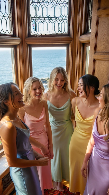
Mixed tones are still a top trend because they look natural and flattering in photos. Choose one fabric (chiffon, satin, matte crepe) and vary tones or colors for cohesive pastel bridesmaid dresses that feel curated, not matchy.
- Coordination tip: keep bouquets simpler if dresses are varied
- Style trick: unify with the same shoe color and similar jewelry
- Palette-friendly: choose shades that match your main linens or stationery
22) Pastel bridal details that stay timeless
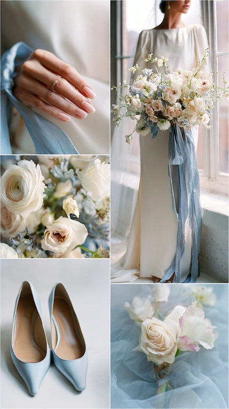
Pastel bridal styling doesn’t require a colored gown. Add softness through accessories: shoes, a veil edge, a hair ribbon, or a bouquet wrap. Keeping the rest minimal makes the color feel like a deliberate design choice.
- Easy ideas: a blush manicure, lavender hair pin, soft blue heel
- Balance tip: if accessories are pastel, keep makeup and jewelry classic
- Photo note: choose pastels that flatter your skin tone under your venue lighting
23) Groomsmen styling with a subtle pastel accent

Neutral suits keep the look sharp, and one pastel detail ties the group into the palette without feeling costume-like. For groomsmen, a tie or pocket square is often enough, especially when boutonnieres echo a bloom used in the bouquet.
- Best suit colors: charcoal, light gray, navy, tan (choose based on venue)
- Accessory rule: pick one pastel tone and repeat it across the party
- Extra polish: match metal details (watch, cufflinks) to your tables
Invitations, stationery, cake & guest details (24–25)
24) Wedding invitations + wedding stationery that preview the palette

Your wedding invitations are the first chance to communicate your style, so keep them consistent with the day-of paper. Choose a clean typeface, a soft wash of color, and paper texture that feels elevated. If you want a clear pastel cue, use pastel wedding invitations and carry the same tone through your wedding stationery (programs, menus, signage).
- Readability tip: use high-contrast ink so text stays crisp in photos
- Finish idea: blind emboss or foil on just one small element
- Cohesion: repeat one motif (border, monogram, or watercolor edge) everywhere
25) A pastel wedding cake with a modern finish
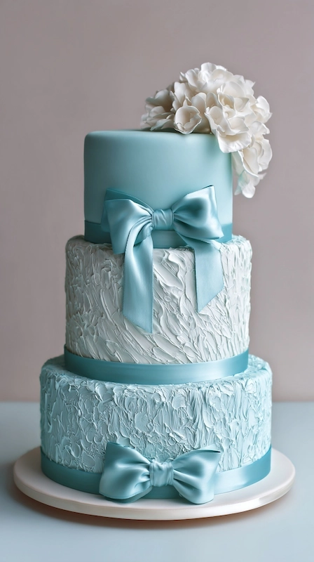
A clean, contemporary pastel wedding cake is one of the easiest ways to reinforce your palette without adding more décor. Keep the design minimal, watercolor buttercream, subtle ombré, or pressed florals, and align the tones with your overall pastel wedding color palette so your wedding cake feels like part of the same story.
- Trending look: smooth buttercream with delicate piping in one pastel tone
- Styling tip: add a small floral cluster at the base that matches your bouquet
- Display: place the cake near good light so color reads clearly in photos
Quick checklist (save this)
- Confirm your wedding color palettes (3–5 tones) and one consistent finish (your metallic accent works well).
- Choose where pastel lives most: linens, florals, attire, or paper.
- Plan your key moments: entry welcome, ceremony focal point, reception tables, and one photo-friendly corner.
- Align fashion details (including bridesmaid dresses) so the palette looks cohesive in photos.
- Consider guest-facing details like wedding favors and flow/signage for wedding guests.
- Factor in your wedding venue lighting and wall colors so pastels don’t look washed out.
If you’re still deciding, start with one hero pastel wedding color and build the rest of your wedding palette around it. That one decision makes every rental, floral, and stationery choice simpler,and helps the entire day feel cohesive.
These ideas also adapt well across seasons: a fall wedding can warm pastels with candlelight and richer greens, and an outdoor wedding often benefits from slightly stronger contrast in signage so everything stays readable in bright light.
Whether you’re planning a classic wedding or a more unique wedding, the most polished pastel celebrations follow the same principle: repeat your palette, edit aggressively, and let a few statement moments do the work. If you’re dreaming of a perfect pastel look, choose your palette first, then build the rest one intentional detail at a time.
Extra note: If you love a softer, storybook feel, this can easily lean into a whimsical pastel wedding style with airy ribbons, delicate florals, and playful stationery. Or keep everything crisp and minimal for a perfect pastel wedding look that reads modern and elevated.

